.png%20edit.avif)
.png%20edit.avif)
.png%20edit.avif)
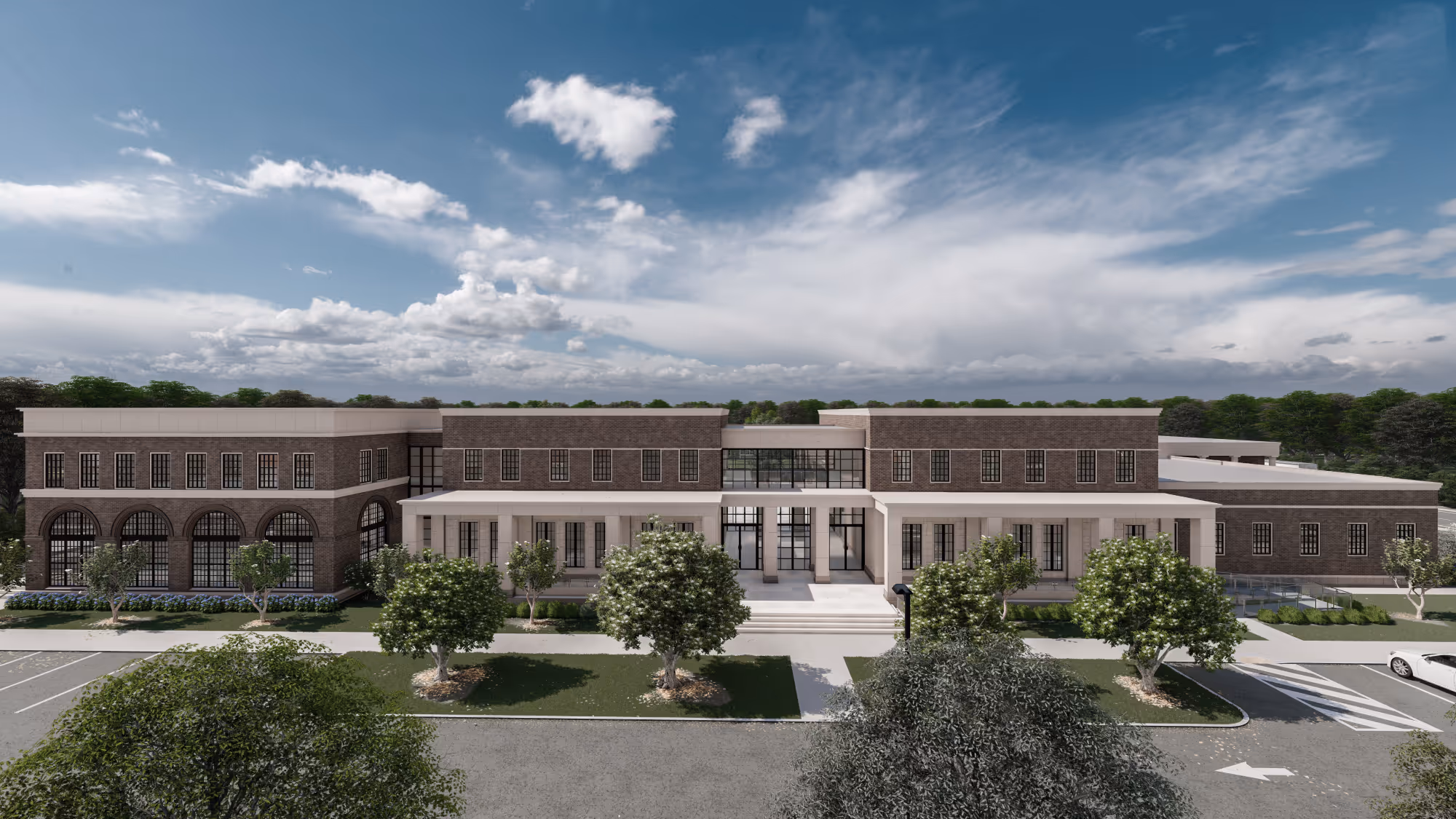
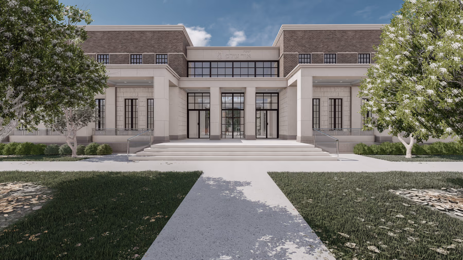
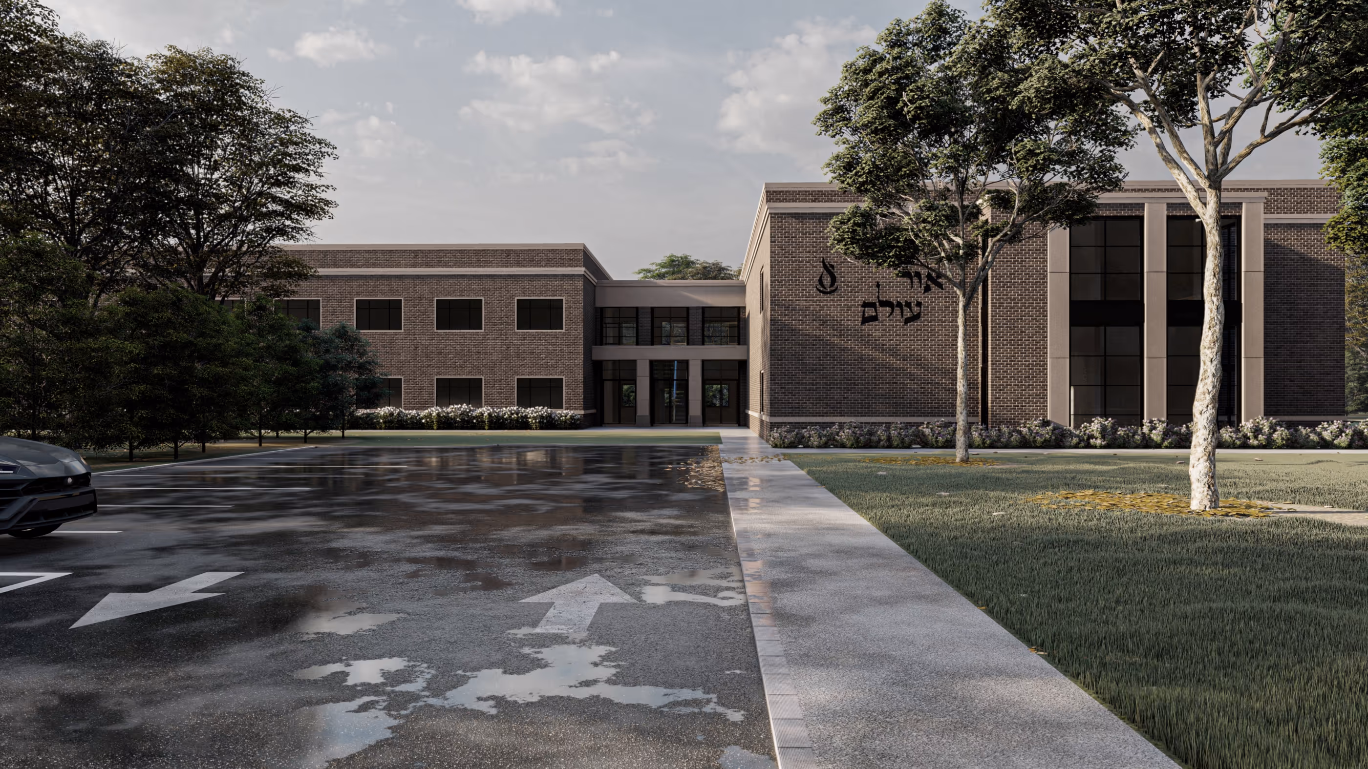
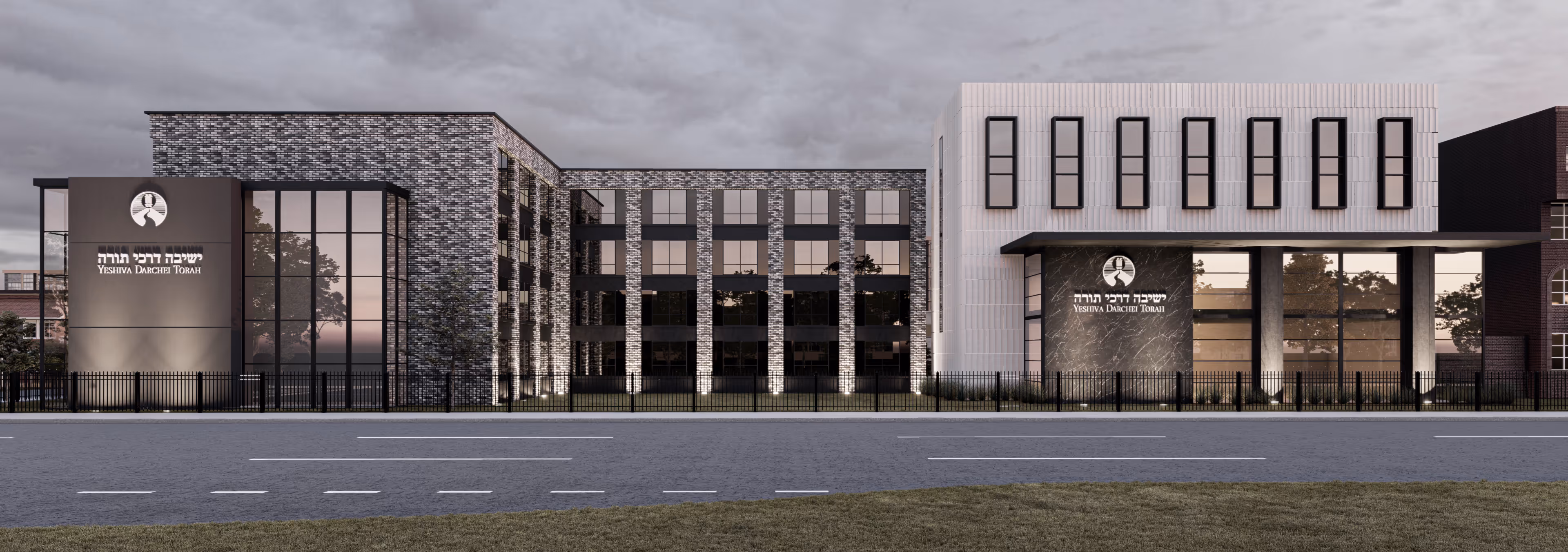
A campus that balances tradition with clarity of form, Yeshiva Ohr Olam unfolds across a generous site in Lakewood, New Jersey—two buildings, distinct in use, aligned in purpose.
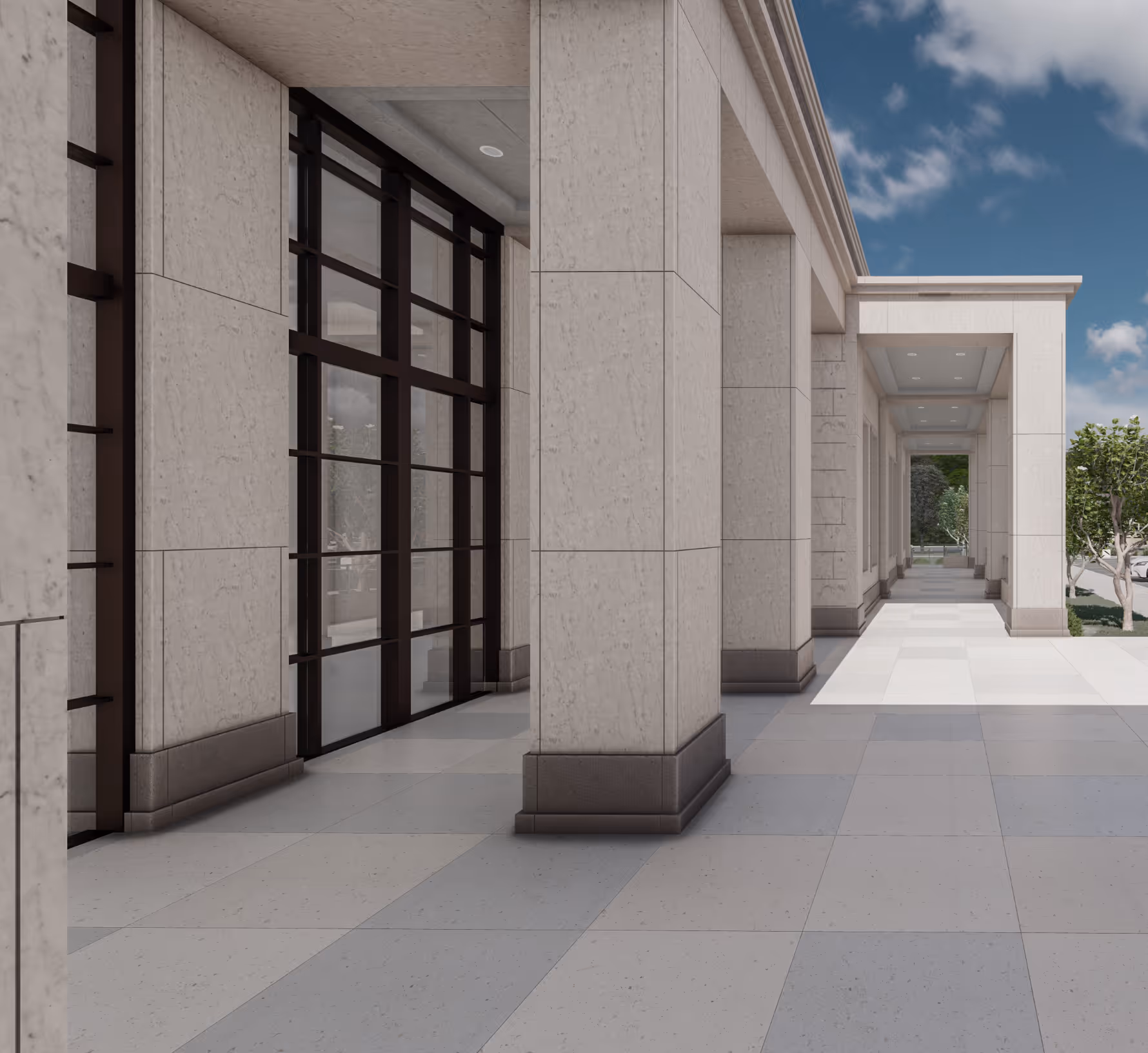
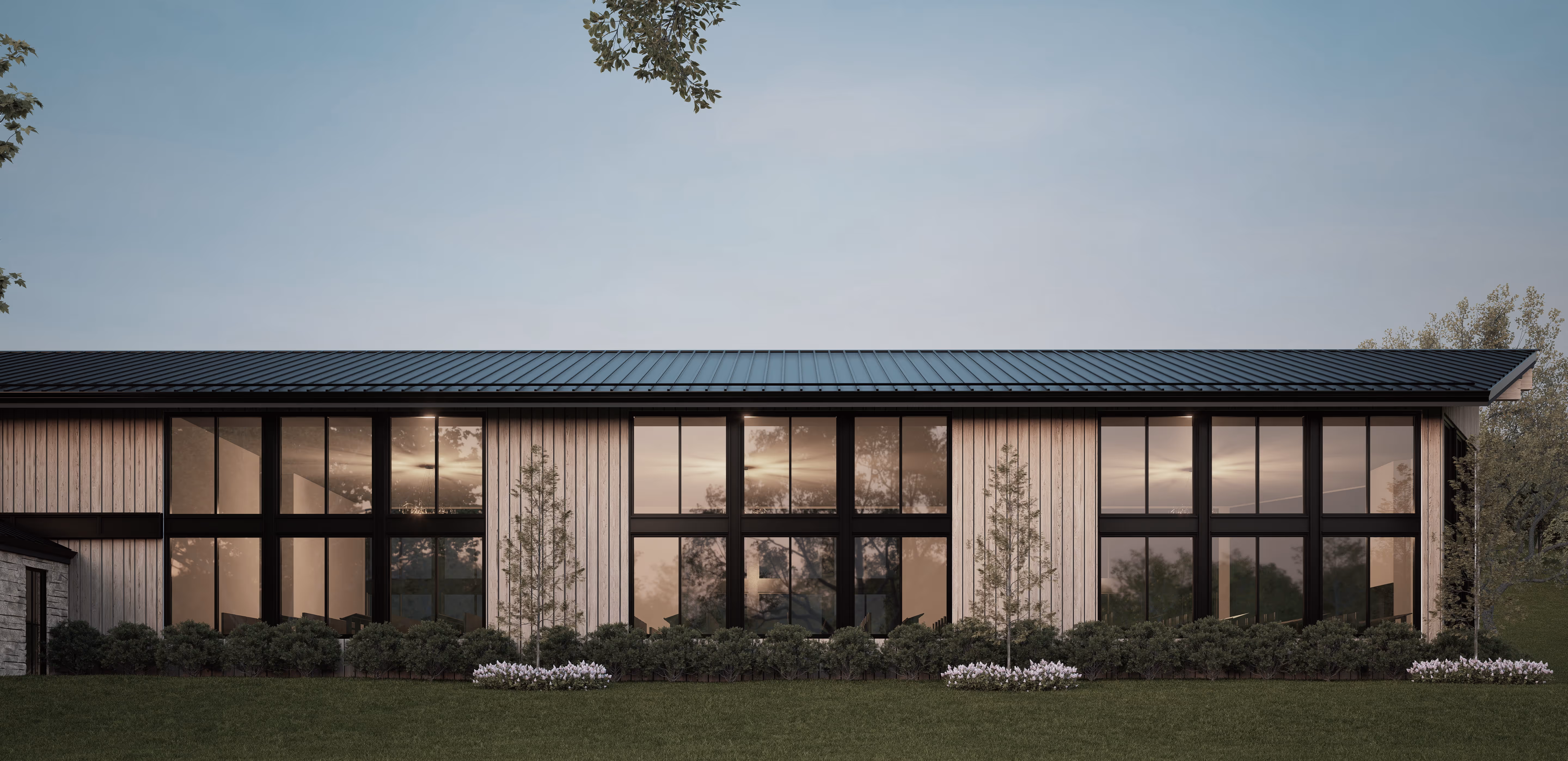
The primary structure presents itself to the street with quiet formality. Strong lines, framed by brick and limestone, lead to a central glass entry—an opening that invites pause and procession. This is the Beis Medrash building: home to higher learning, daily rhythm, and reflection.
Inside, a gracious lobby anchors both arrival and flow—transparent front to back, offering framed views of the landscaped grounds beyond. Within, the Beis Medrash reveals itself as a luminous core, grounded by a library that hides in plain sight. A concealed wall slides open when needed, allowing the space to stretch and gather more voices.
Though the building houses both a Hebrew college and a high school, their paths remain respectfully separate. Along the side street, the high school entrance sits tucked and purposeful, leading to its own study hall and classrooms. The two programs remain apart in circulation, meeting only through the rabbi’s shared office—an architectural boundary crossed only with intention.
Toward the rear, a full-scale gymnasium speaks to movement and community. Beneath, a dining hall offers warmth below grade—an unexpected moment of light and gathering.
.png%20edit.avif)
.png%20edit.avif)
.pngedit.avif)
.png%20edit.avif)
.png%20edit.avif)
.png%20edit.avif)
.png%20edit.avif)
.png%20edit.avif)
.png%20edit.avif)
.png%20edit.avif)
.png%20edit.avif)
.png%20edit.avif)
.png%20edit.avif)
.png%20edit.avif)
.png%20edit.avif)
.png%20edit.avif)
.png%20edit.avif)
Beyond the main structure of the Yeshiva building, the residence hall offers a quiet sanctuary. Set back from view, it serves as both retreat and refuge. Inside, lounges and shared spaces echo the atmosphere of the greater campus: thoughtful, welcoming, complete.
A space designed not just to contain, but to support and elevate.
.png%20edit.avif)
.png%20edit.avif)
.png%20edit.avif)
.png%20edit.avif)
.png%20edit.avif)
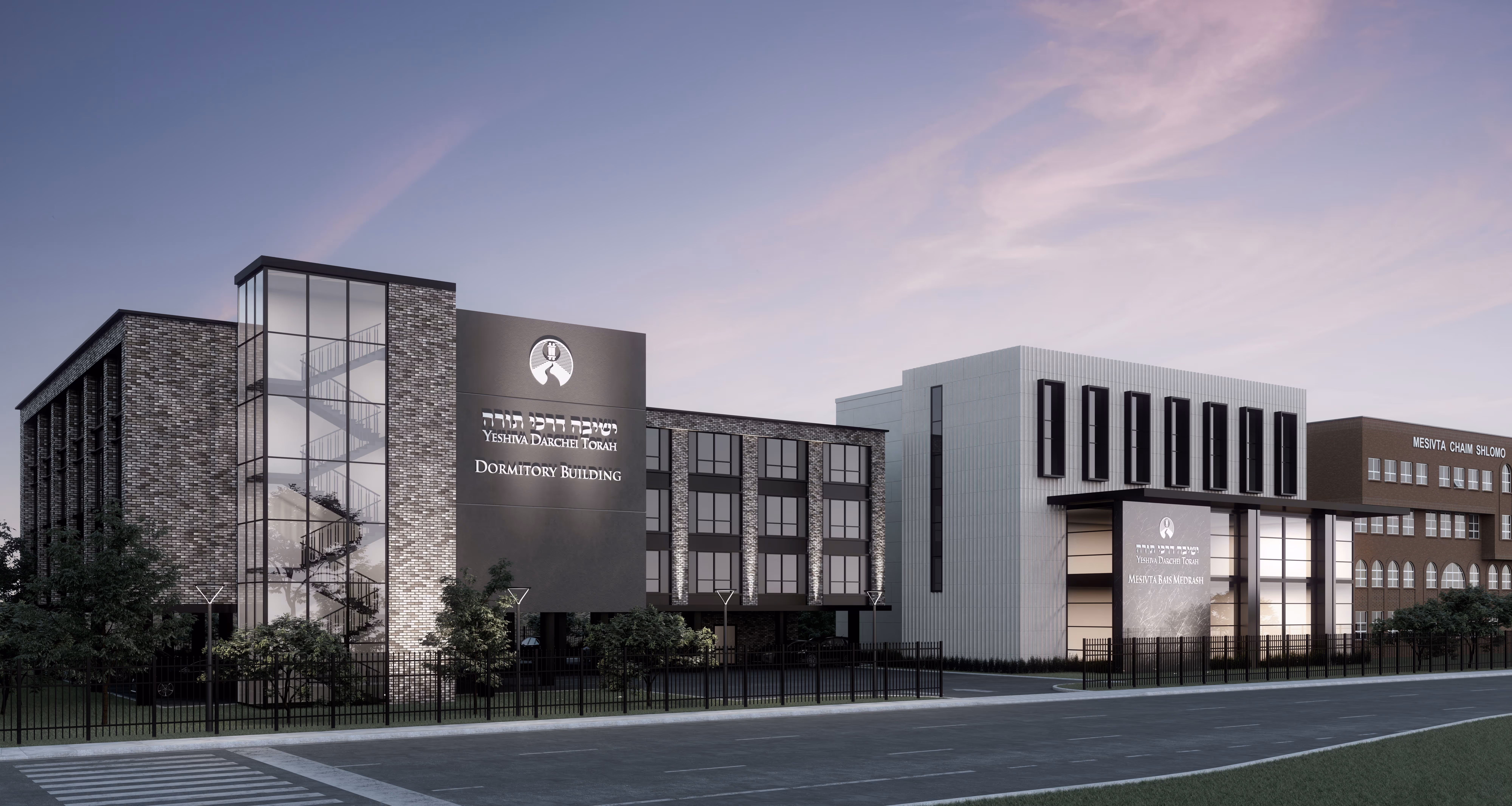
An institution built on continuity—of learning, of values, of place. The campus, already composed of stately structures and long-held purpose, called for an expansion not of ambition, but of alignment.
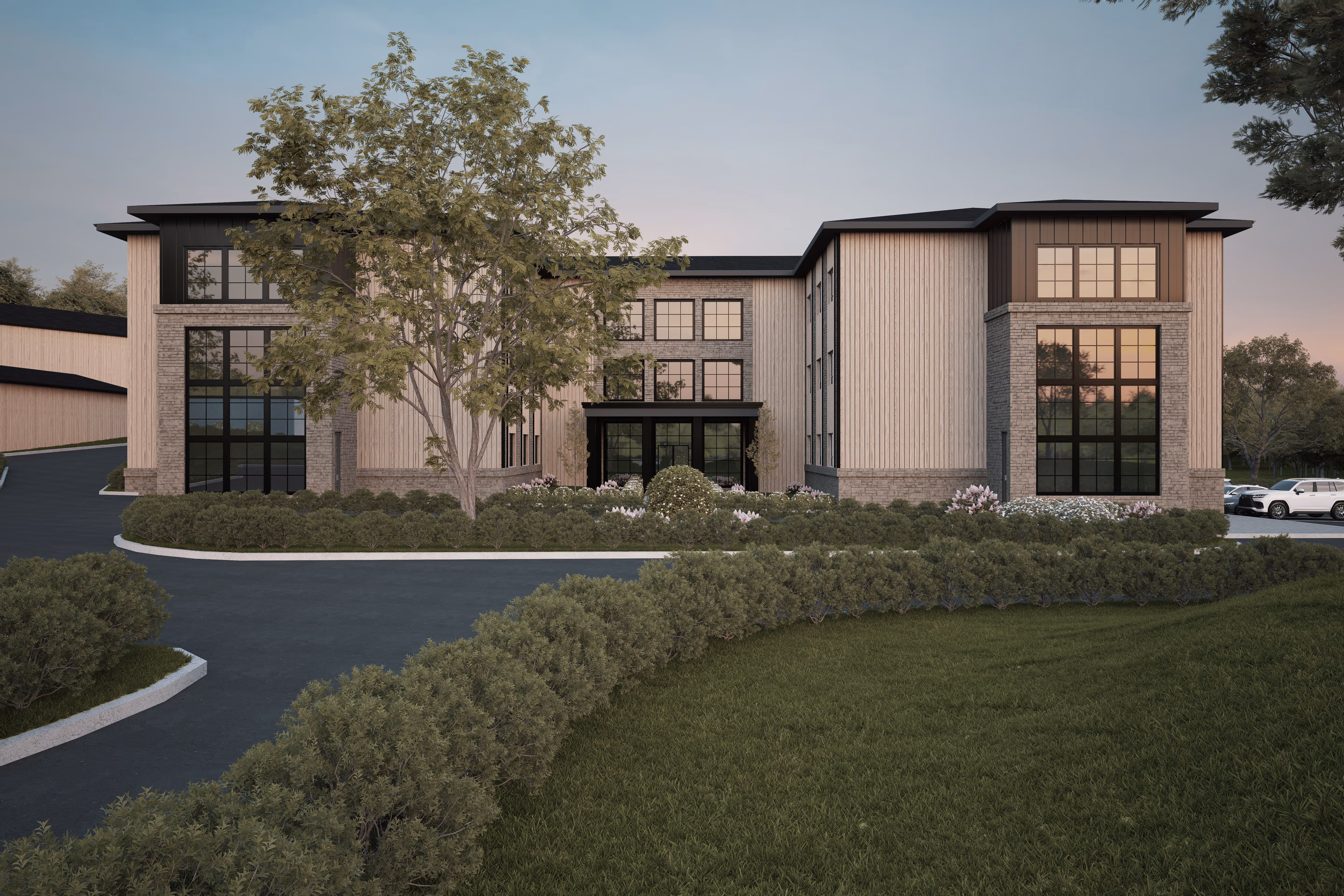
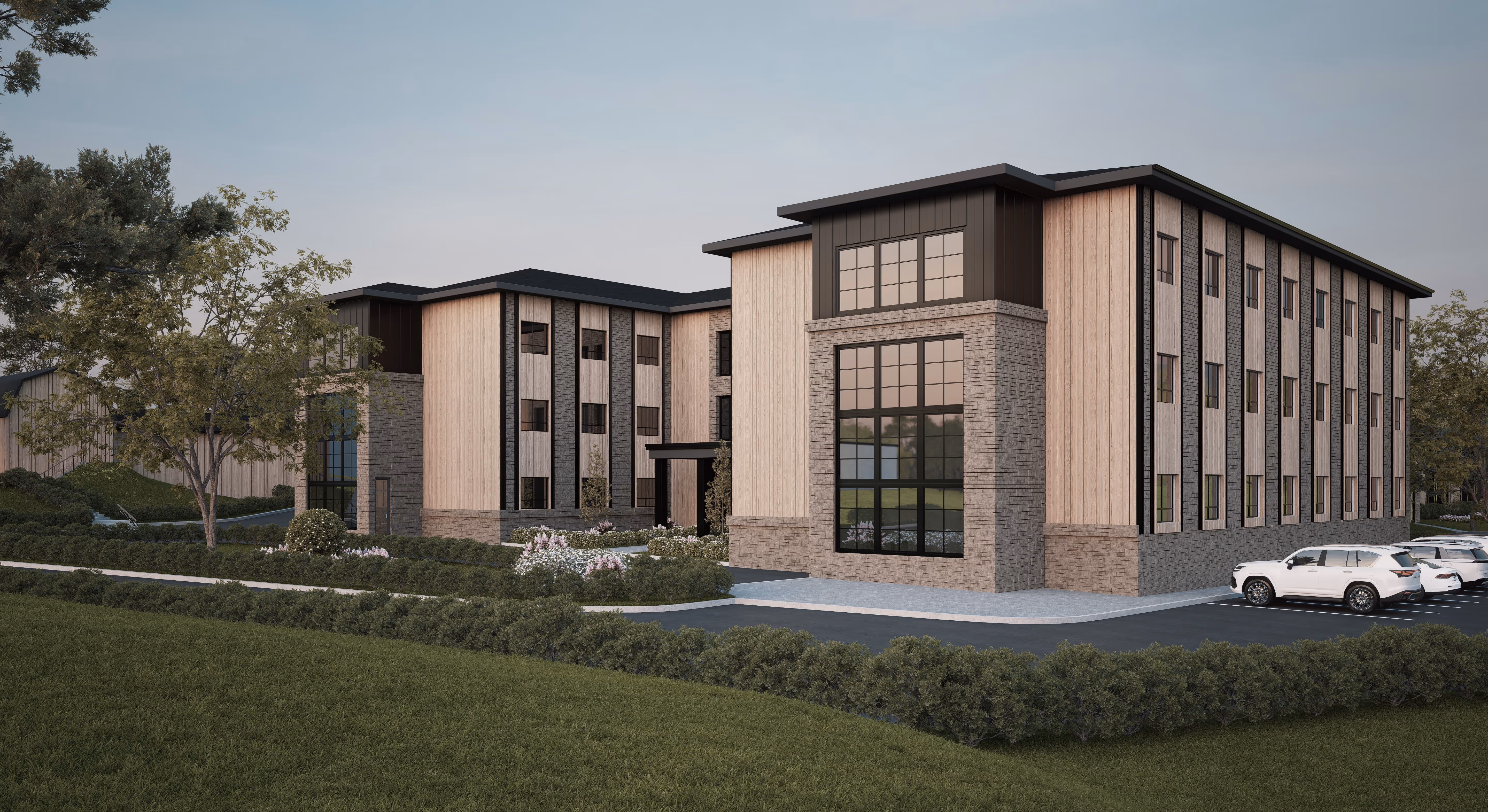
Two new buildings emerge from this dialogue: a Beis Medrash and a Dormitory, designed not as additions but as extensions—intuitive, seamless, inevitable.
The Beis Medrash anchors its presence in fluted limestone and blackened steel—material quietude for a place of focused study. Above, classrooms unfold with calm proportion, their cadence echoing the rhythm of thought. Across the breezeway, the Dormitory stands grounded in textured brick and dark steel, its form softened by the glow of a transparent stair tower.
Inside, spaces shift in scale and mood. The dormitory holds not only rooms but moments—lounges for pause, gathering, reflection. Throughout, circulation flows with intention: breezeways, thresholds, and light pulling gently from one space to the next.
These are buildings made to belong—to their context, to their purpose, and to the students who will pass through them, carrying forward the story they quietly support.
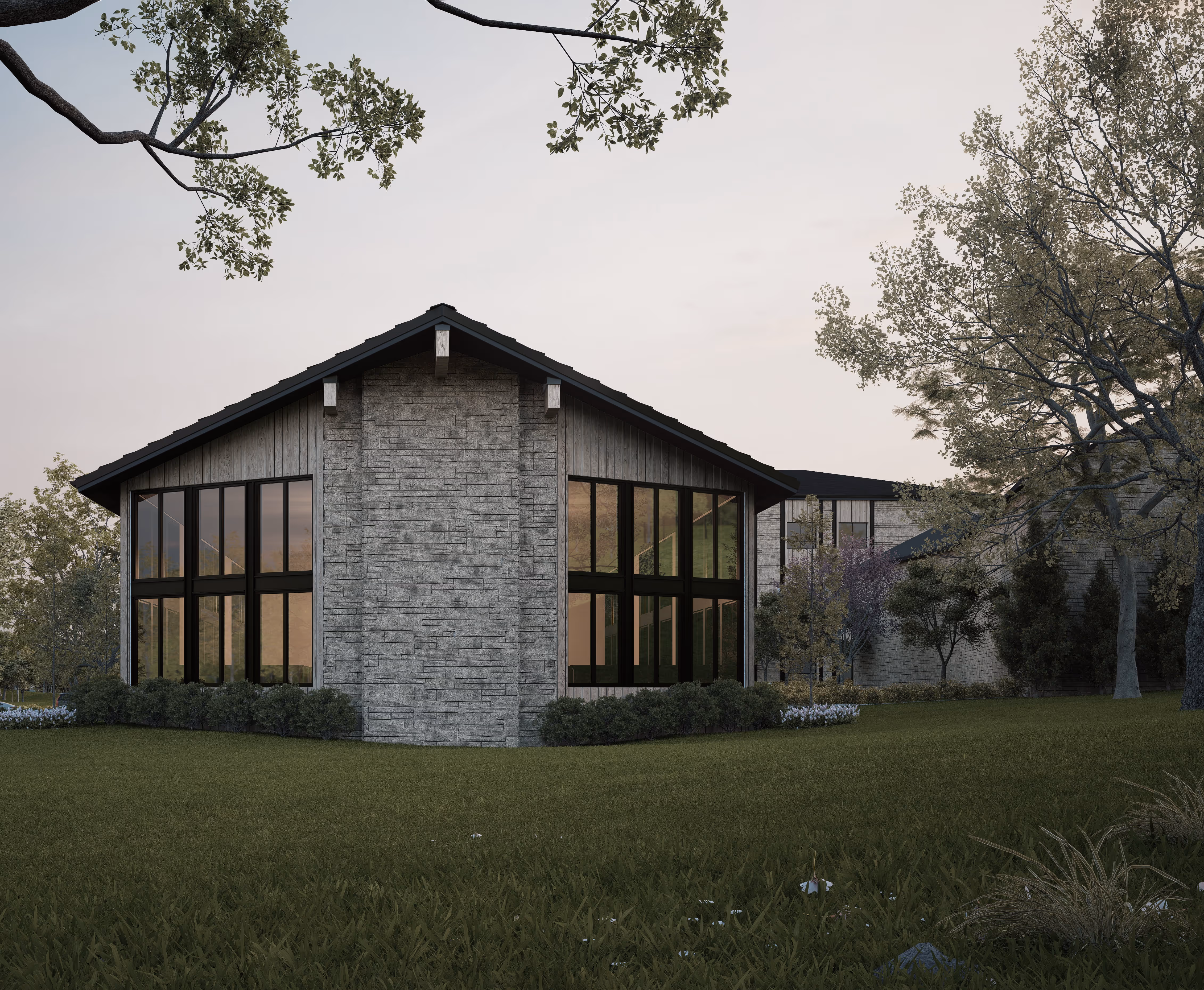
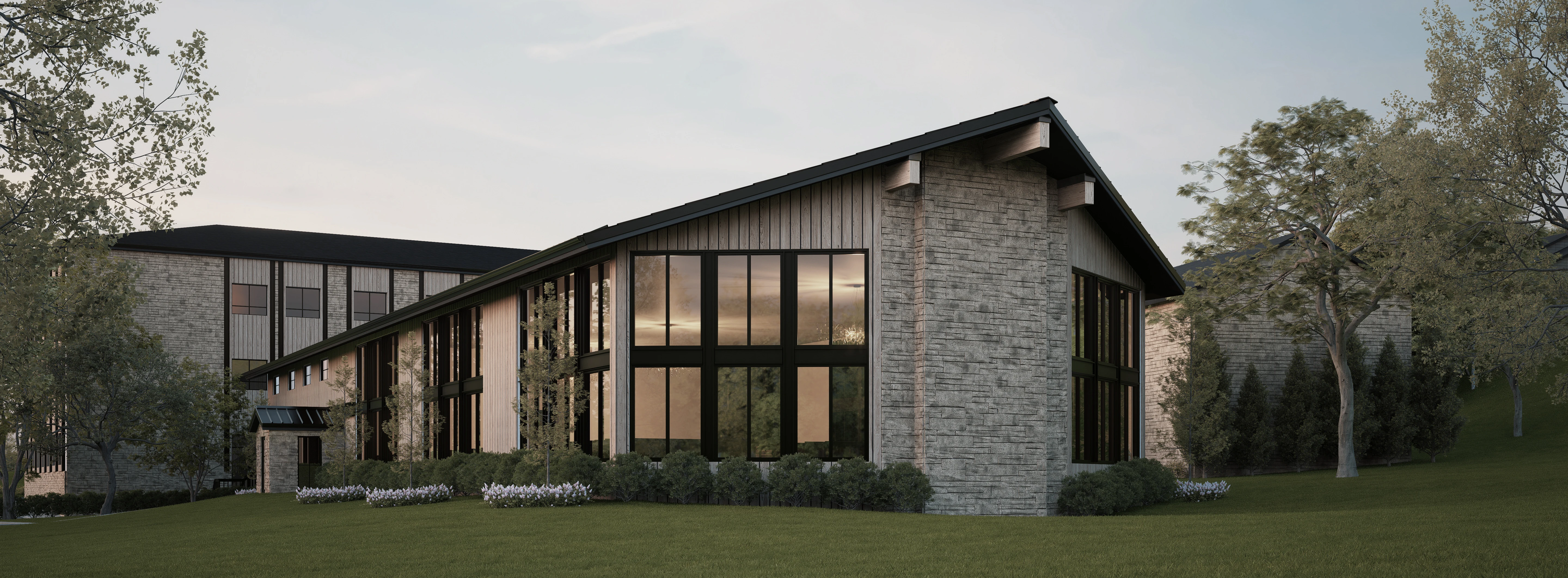
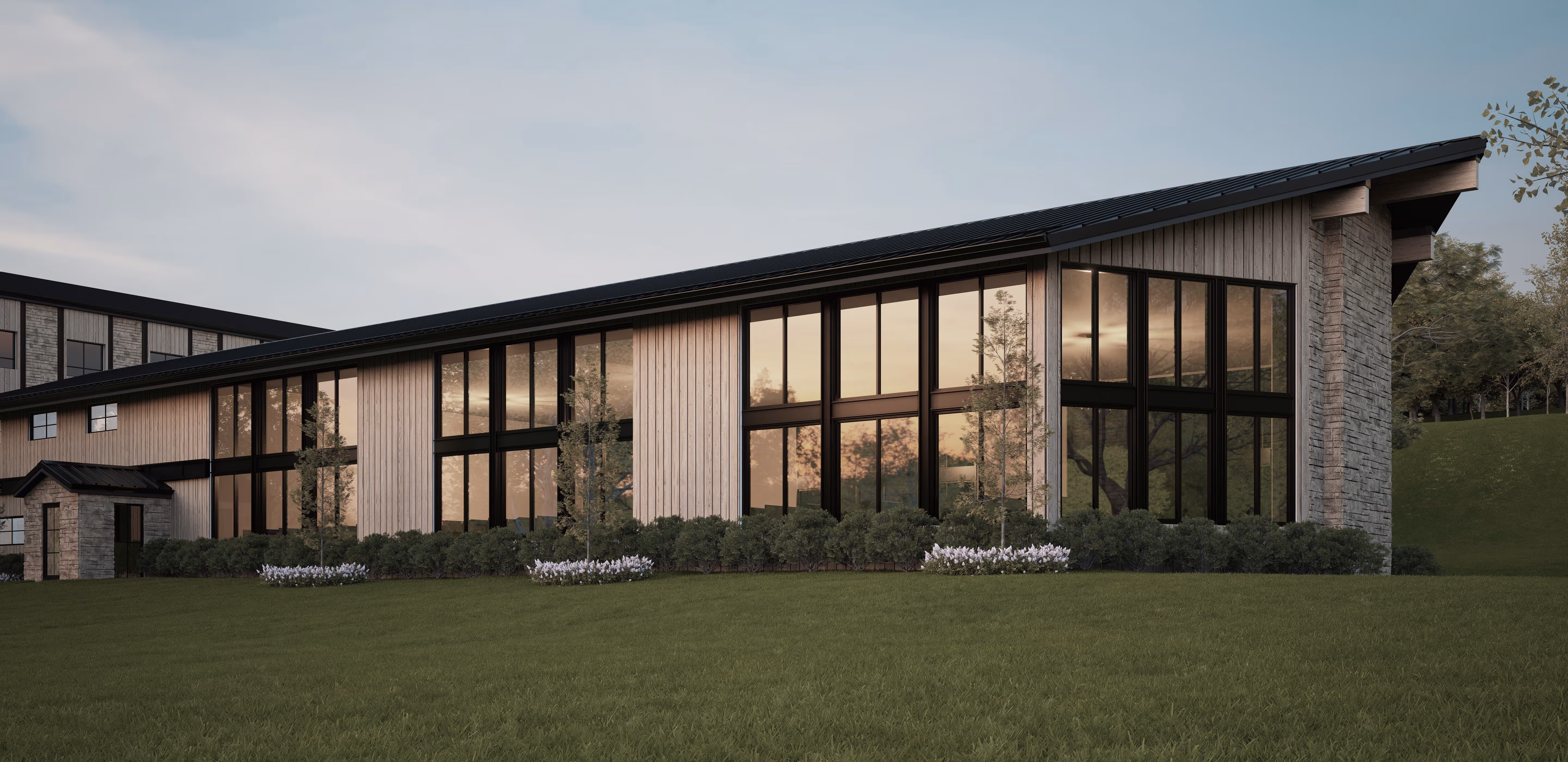
Set within the rolling, wooded landscape of a former ranch, the expansion of Yeshiva Ohr Hameir strengthens the campus identity while preserving its natural character. At the heart of the plan is the sanctuary—aluminous and grounded space that serves as both anchor and destination, with all campus paths and buildings leading toward it.
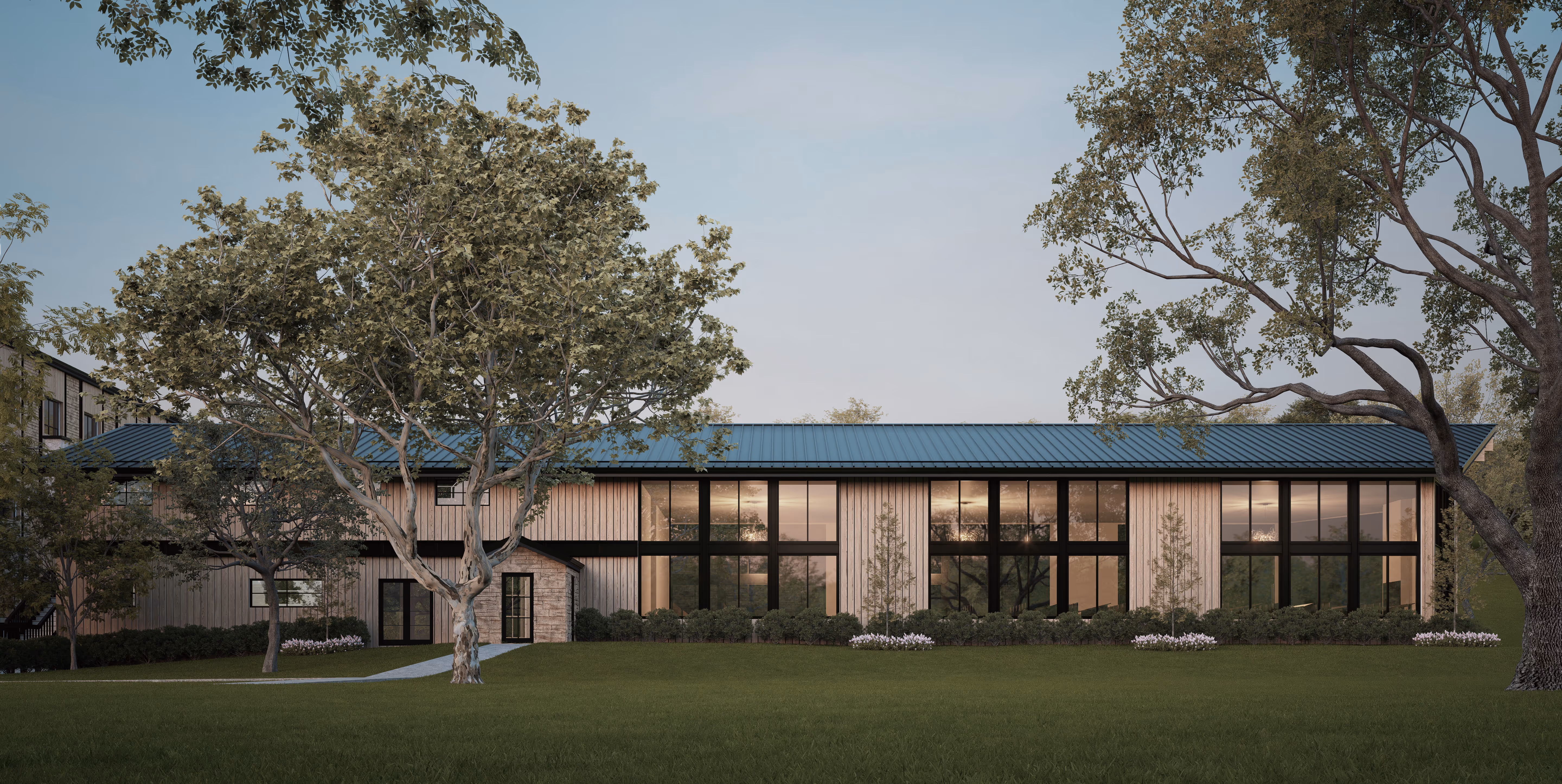
The project includes an expanded Bais Medrash building, framed in warm stone and vertical wood, whose large windows open the study hall to natural light and views of the surrounding greenery. A new dormitory building accommodates the yeshiva’s growth, designed to integrate with the existing campus flow while providing students with a sense of connection, community, and belonging.
Beyond these new structures, improvements to the dining hall and staff housing further enhance daily life on campus, supporting both study and living in balance. Together, these interventions continue the yeshiva’s legacy, creating spaces that are elevated yet approachable—rooted in tradition while open to the landscape and the future.
.png%20edit.avif)
.jpg%20edit.avif)
.png%20edit.avif)
Set within a residential neighborhood, this shul was designed to feel at home among houses—while still rising to the significance of its purpose. The exterior draws on classical symmetry and scale, with arched windows, pilasters, and a mansard roof evoking the language of a grand home rather than an institution.
Inside, the sanctuary opens to a soaring two-story volume, flooded with light. A women’s gallery wraps in a gracious U-shape above. The interior balances opulence and restraint: crystal chandeliers, a coffered dome, and rhythmic paneling elevate the space while maintaining warmth and clarity. Materials and detailing are used meaningfully, drawing attention to the bimah and aron with emphasis.
The building includes a sunlit lobby, designed as both entry and gathering space, and a simcha/kiddush hall that supports communal life beyond prayer.
.png%20edit.avif)
.png%20edit.avif)
.png%20edit.avif)
.png%20edit.avif)
.png%20edit.avif)
.png%20edit.avif)
.png%20edit.avif)
.png%20edit.avif)
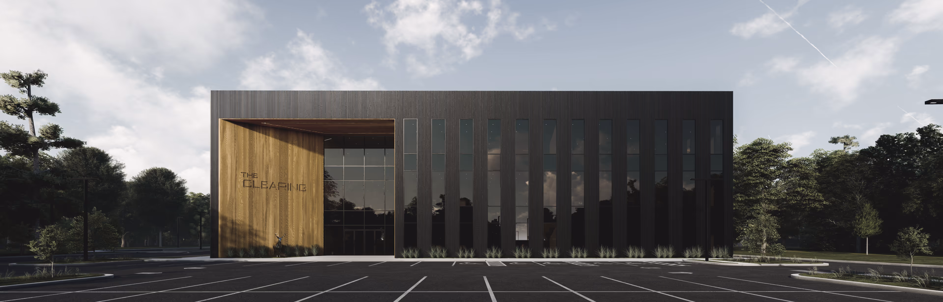
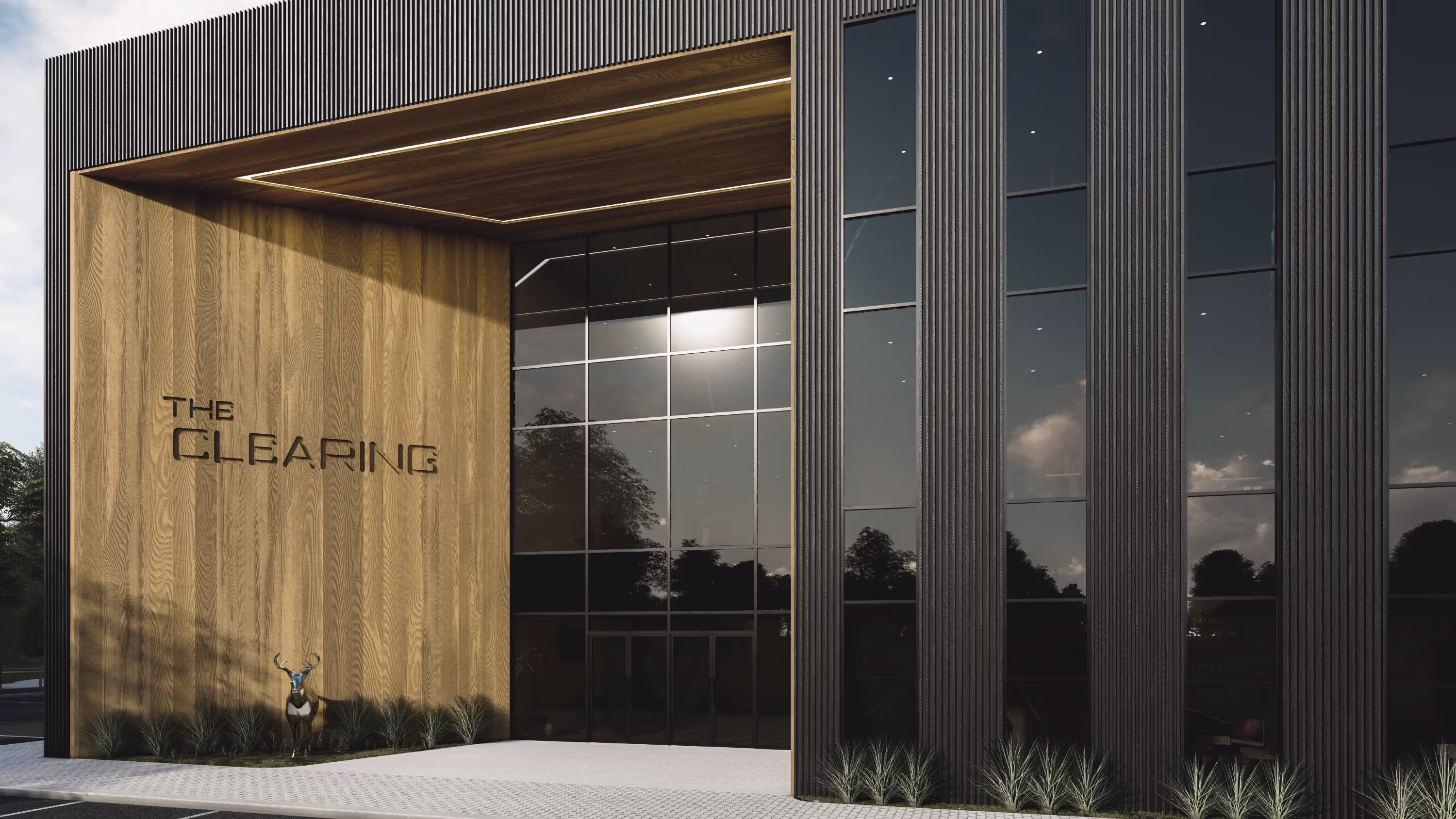
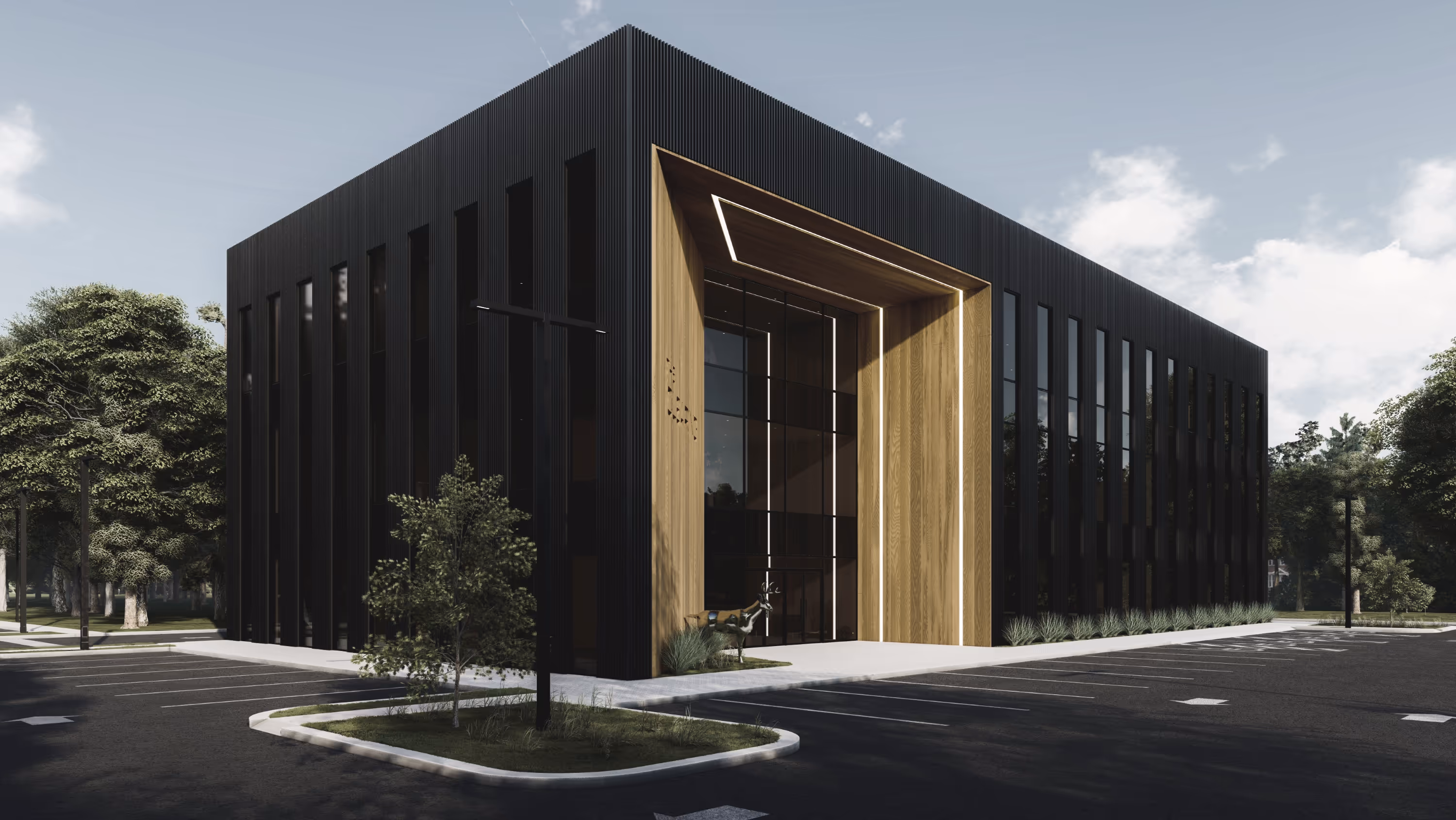
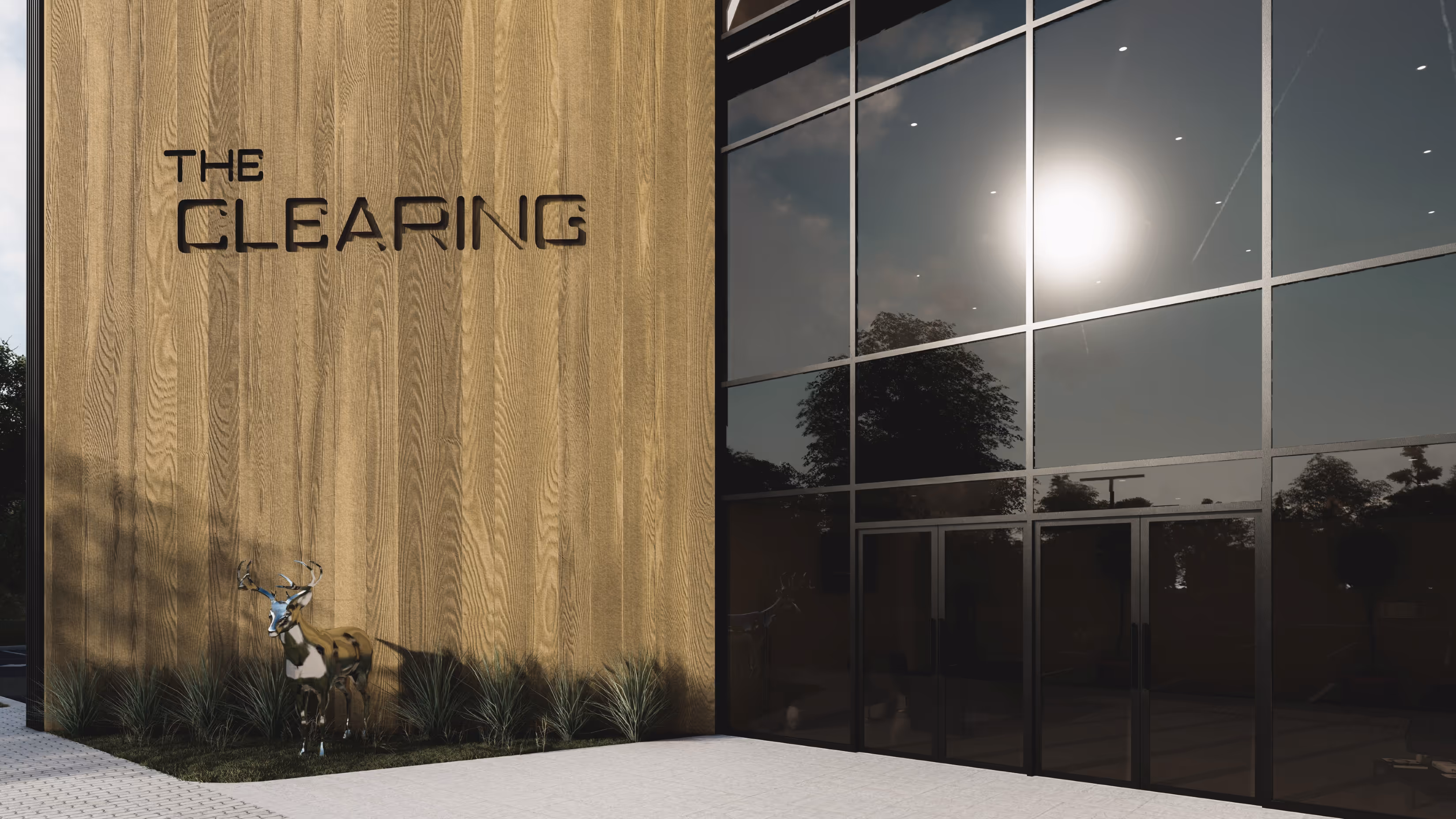
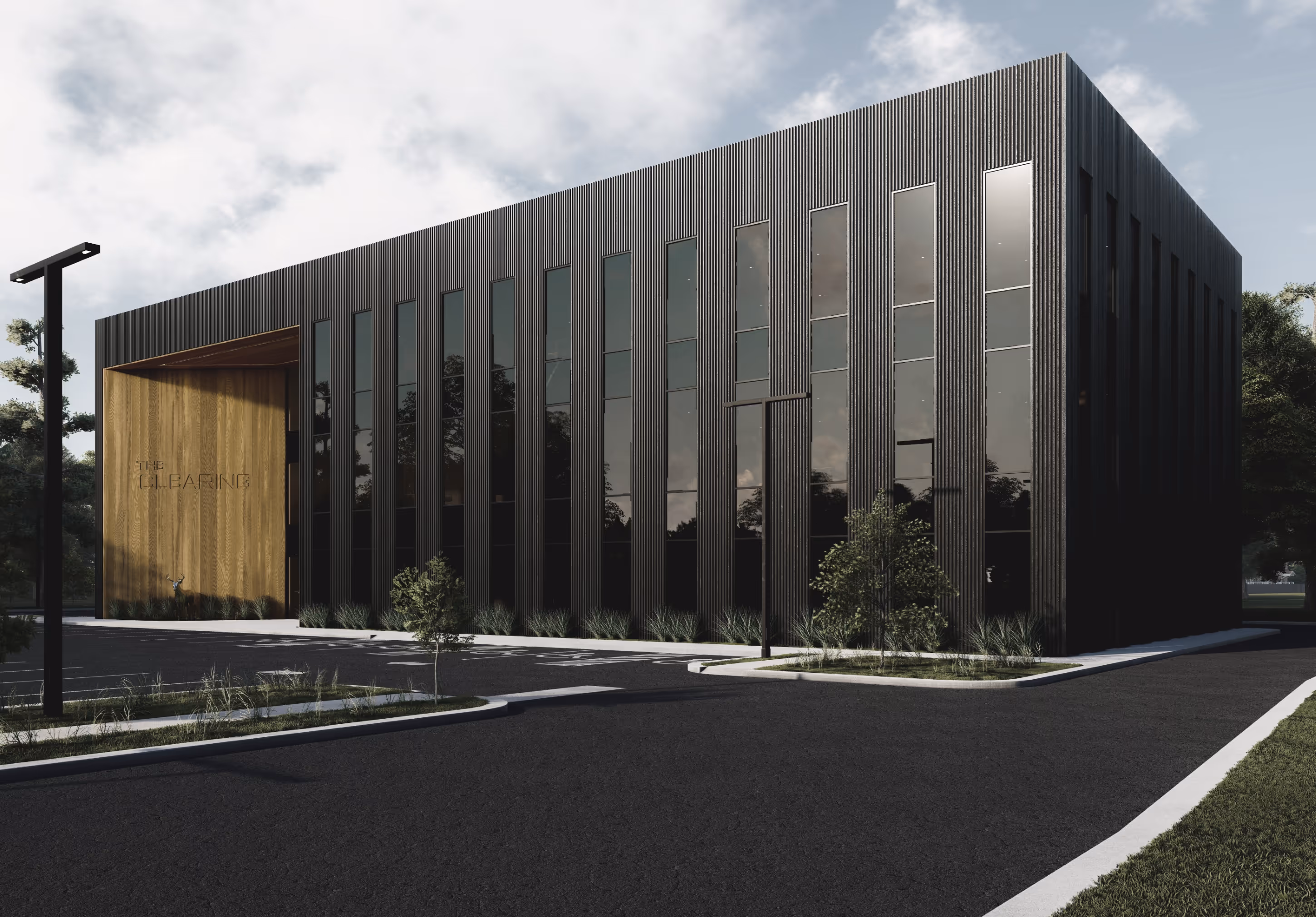
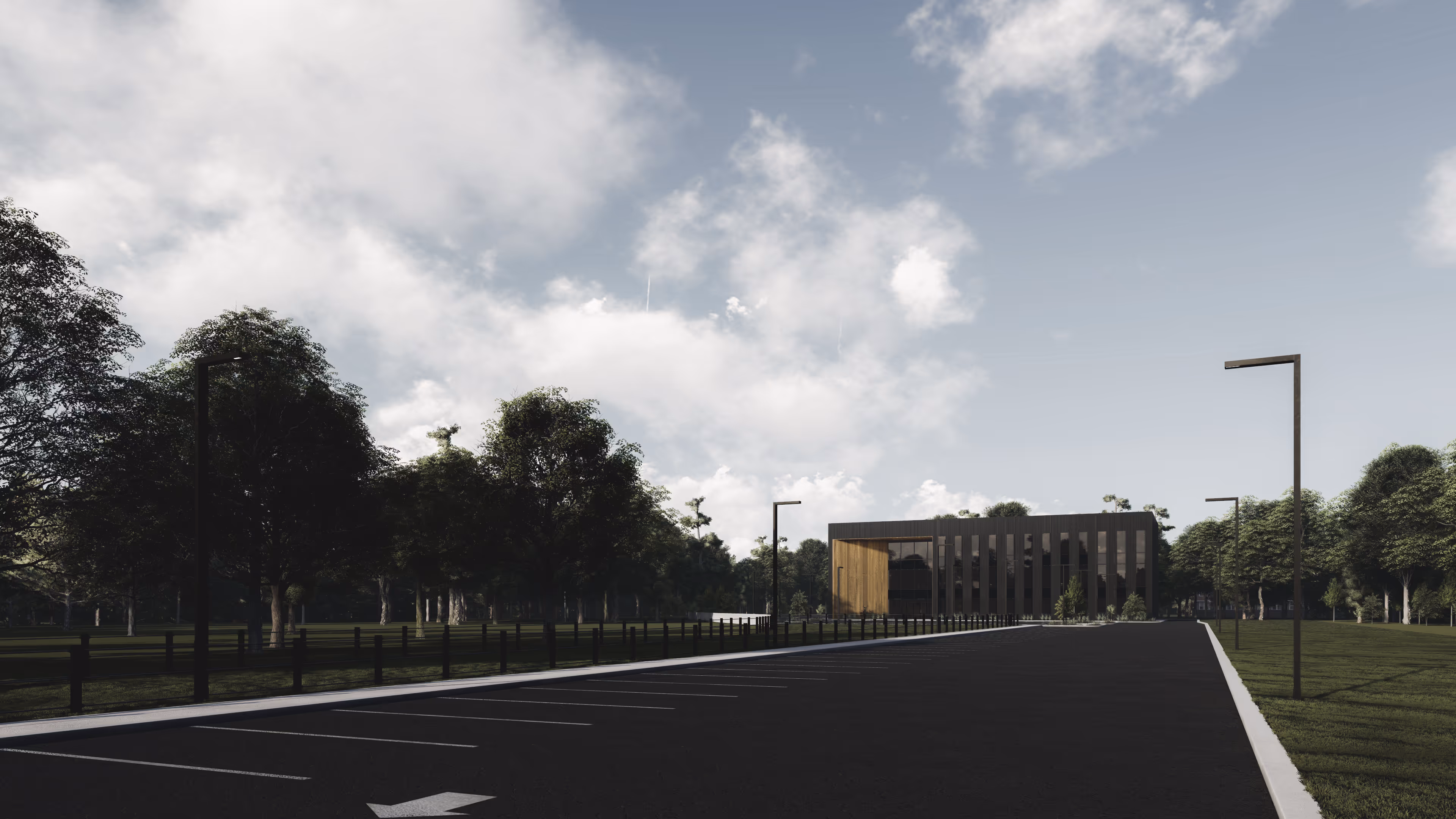
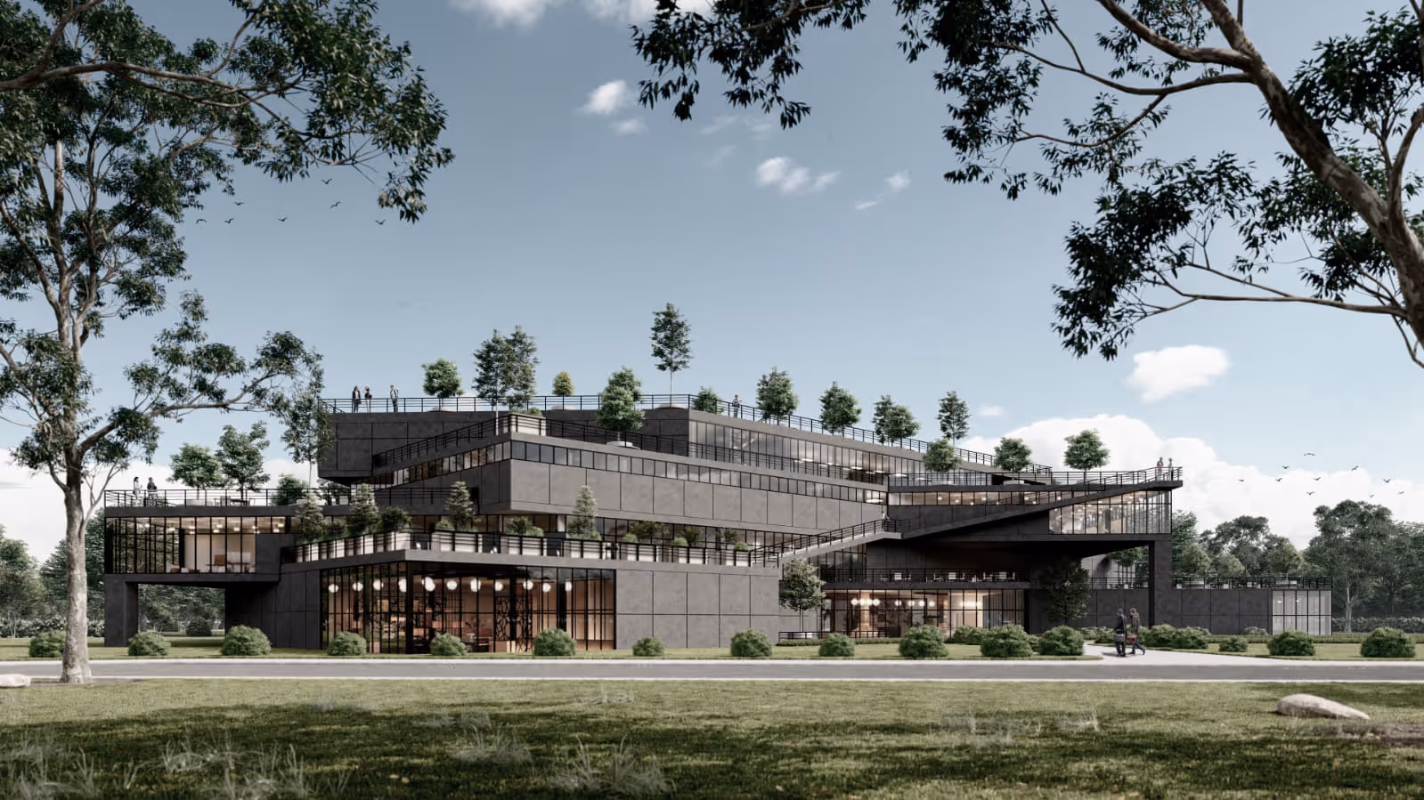
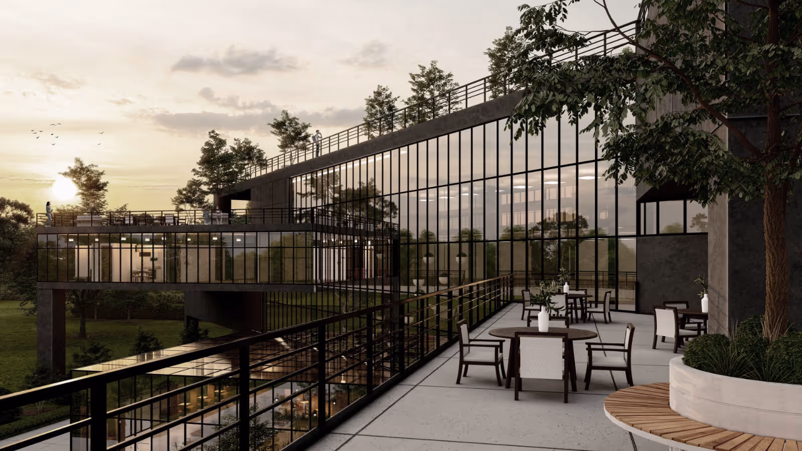
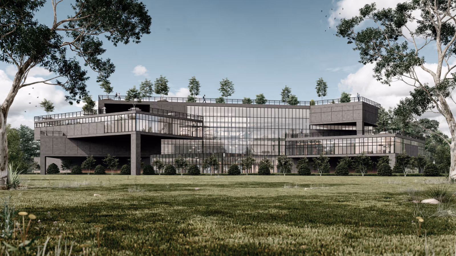
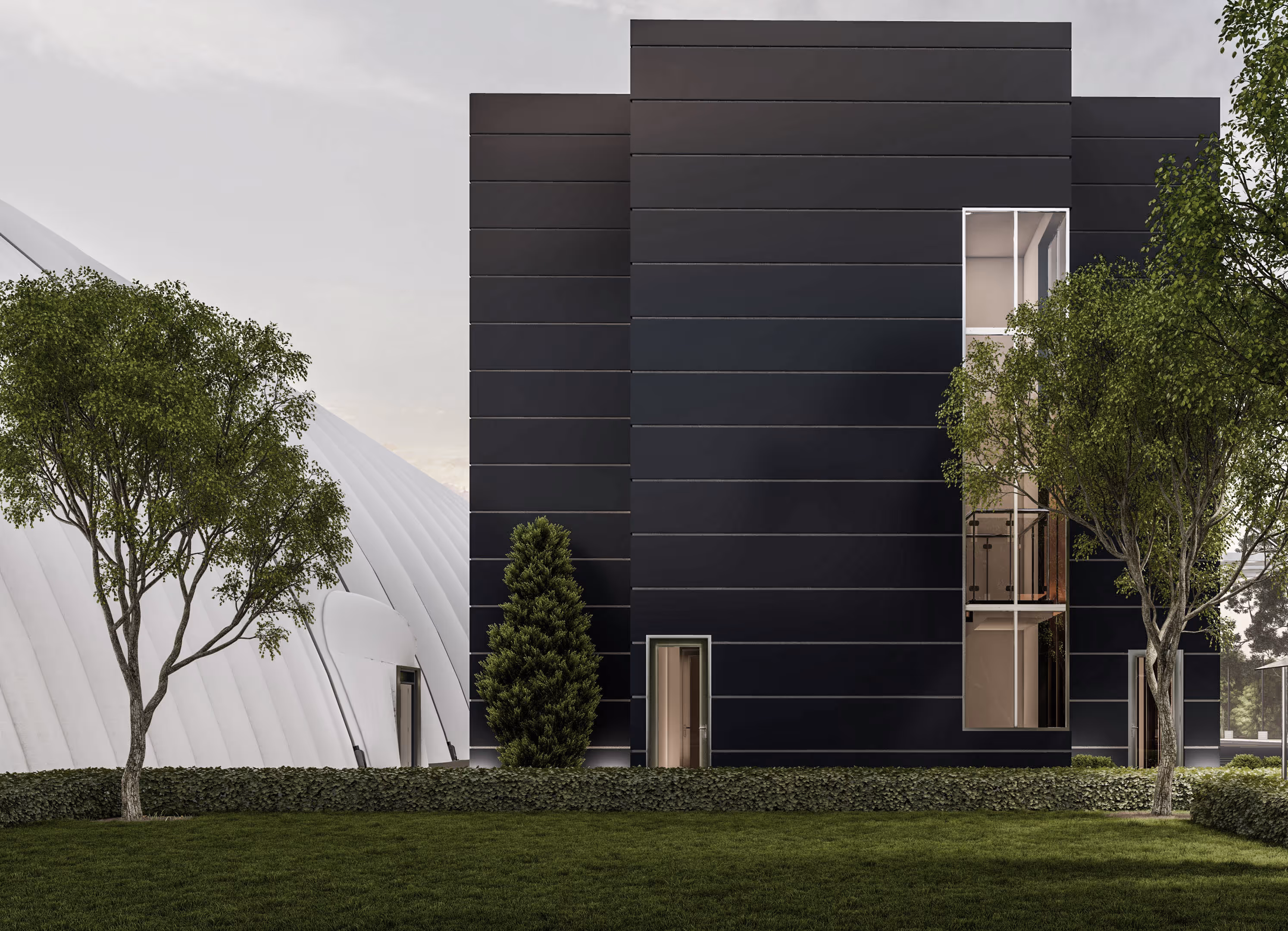
Set deep in the woods and well back from the road, this office building is designed to emerge quietly from its surroundings. We leaned into the forest—its calm, its palette, its rhythms—and let those cues guide the architecture.
The façade plays with contrast drawn from the anatomy of a tree: a dark exterior shell reminiscent of bark, textured and shadowed, gives way to a lighter wood surface carved into the entry. The warm inset—like a clearing in the trees—draws visitors in, creating a moment of pause and welcome.
Wood tile cladding anchors the building in its wooded context, while the proportions remain clean and contemporary. Vertical windows rhythmically echo tree trunks, allowing filtered light within. The design is minimal, deliberate, and grounded—at home in the landscape without replicating it.
This shul design blends timeless tradition with a clean, modern aesthetic. The façade is clad in warm stone, evoking permanence and strength, while expansive windows flood the sanctuary with natural light and create a sense of openness and connection to the surrounding landscape. The steeply pitched roofline gives the structure a classic profile, while dark metal accents and glass panels bring a contemporary edge.
Inside, the large windows highlight the glowing chandeliers, offering a glimpse of the vibrant communal life within. The building is thoughtfully scaled to feel welcoming and accessible, with a dedicated entrance and clear pathways. The landscaping complements the architecture with neat plantings and greenery.

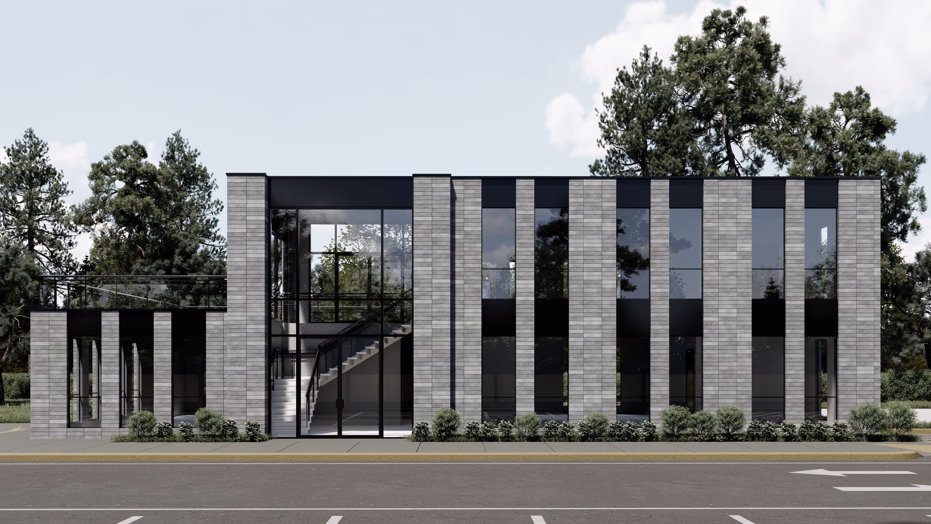
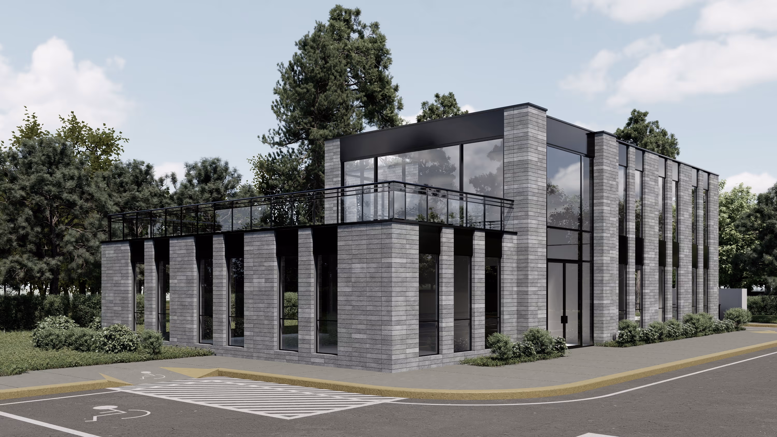
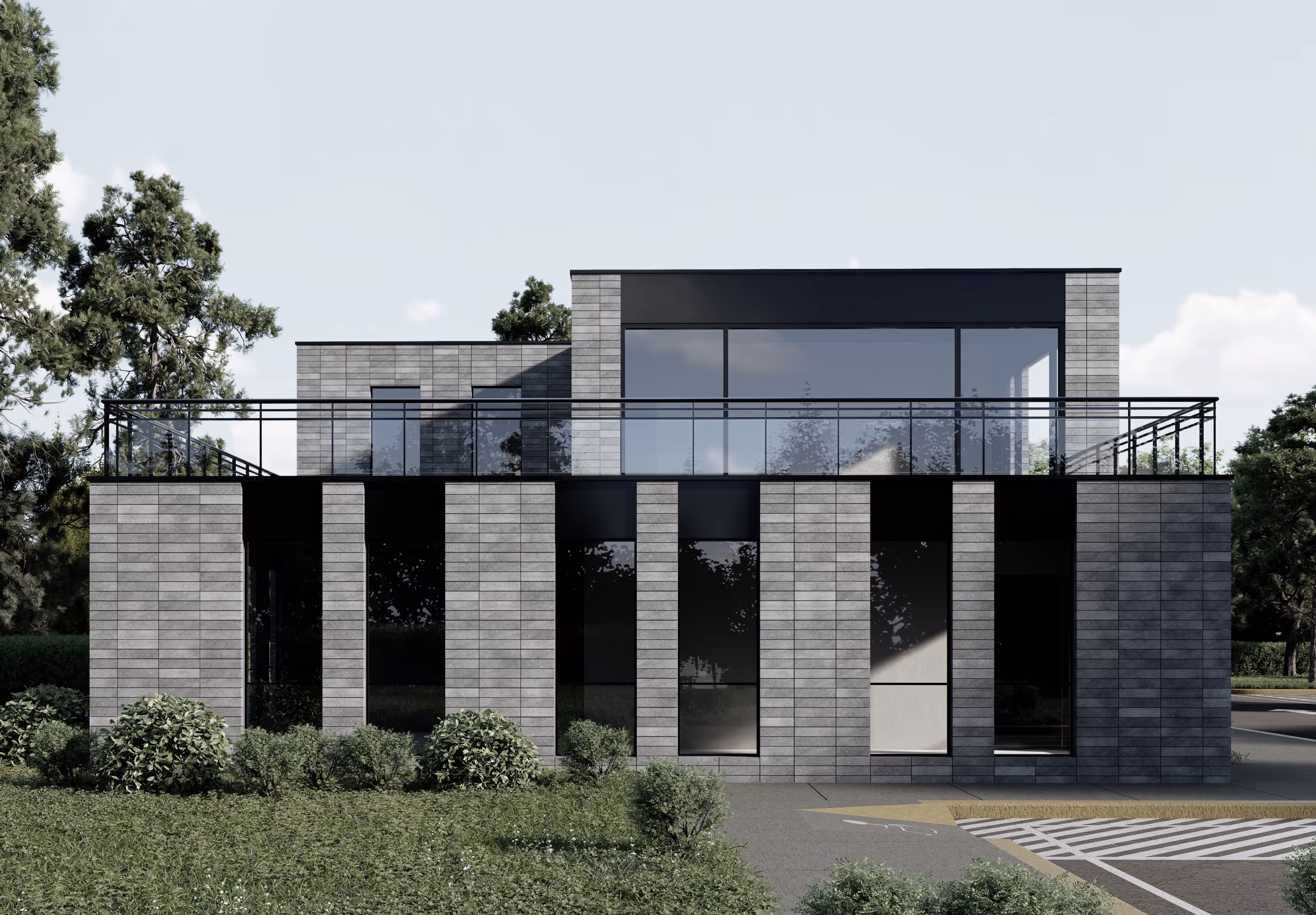
Set between two historic Brooklyn buildings, this new home for the Belz Boys Elementary School required a careful balance of presence and deference—asserting its own identity while honoring the rhythm of the street. The project emerged not as a singular architectural gesture, but as a nuanced response to a complex set of constraints and intentions.
Zoning regulations shaped the massing from the outset. To protect light on the street, upper floors were strategically set back—allowing the building to rise in harmony with its surroundings rather than overshadow them. Beneath this stepped form, the structure integrates an existing steel bracing system—an inherited framework that guided both layout and logic. We worked with it, using the constraints to shape the design.
At street level, the building takes on another role: a wedding hall for the community. This dual use called for materials that are both practical and dignified. Limestone, glass, and steel provide that balance—solid yet open, with a clear rhythm across the façade.
.jpg%20edit.avif)
Designed with economy in mind, this office building reimagines what’s possible within the limits of wood-frame construction. The design borrows from the visual language of steel and concrete—strong horizontals, clean reveals, and a crisp grid of glazing—without relying on their material heft.
A vertical tower element breaks the symmetry and marks the entry, while subtle shifts in texture and tone give the façade depth and variation. The overall composition is streamlined, disciplined, and quietly modern.
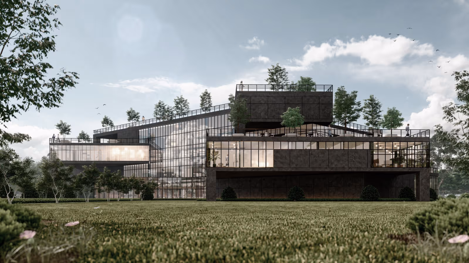
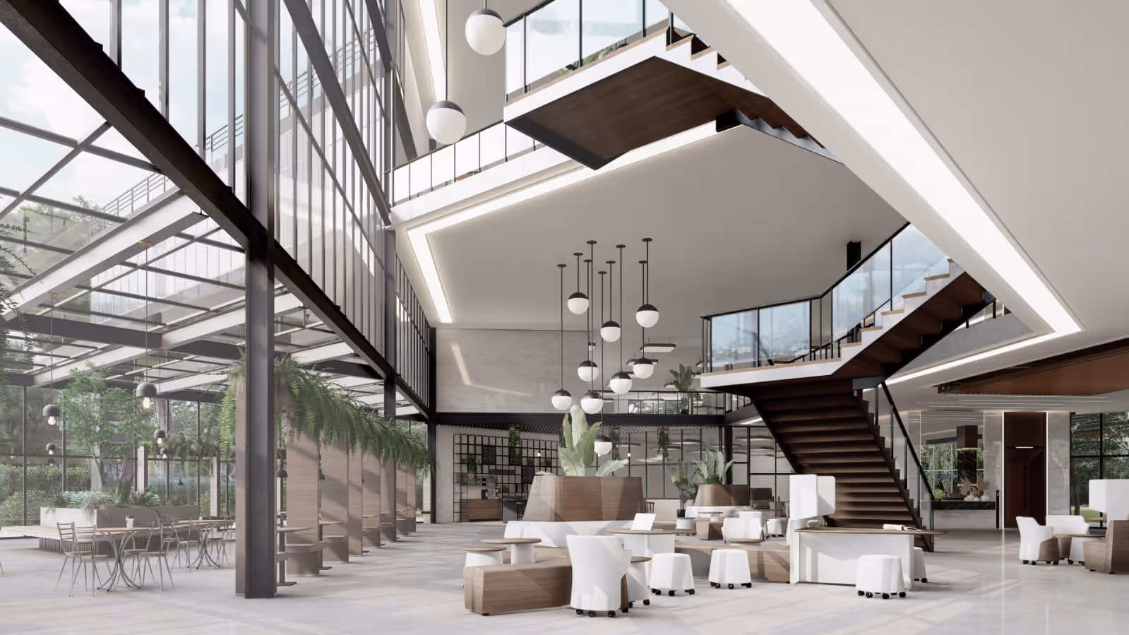
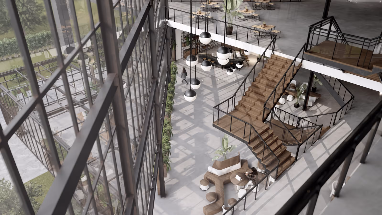
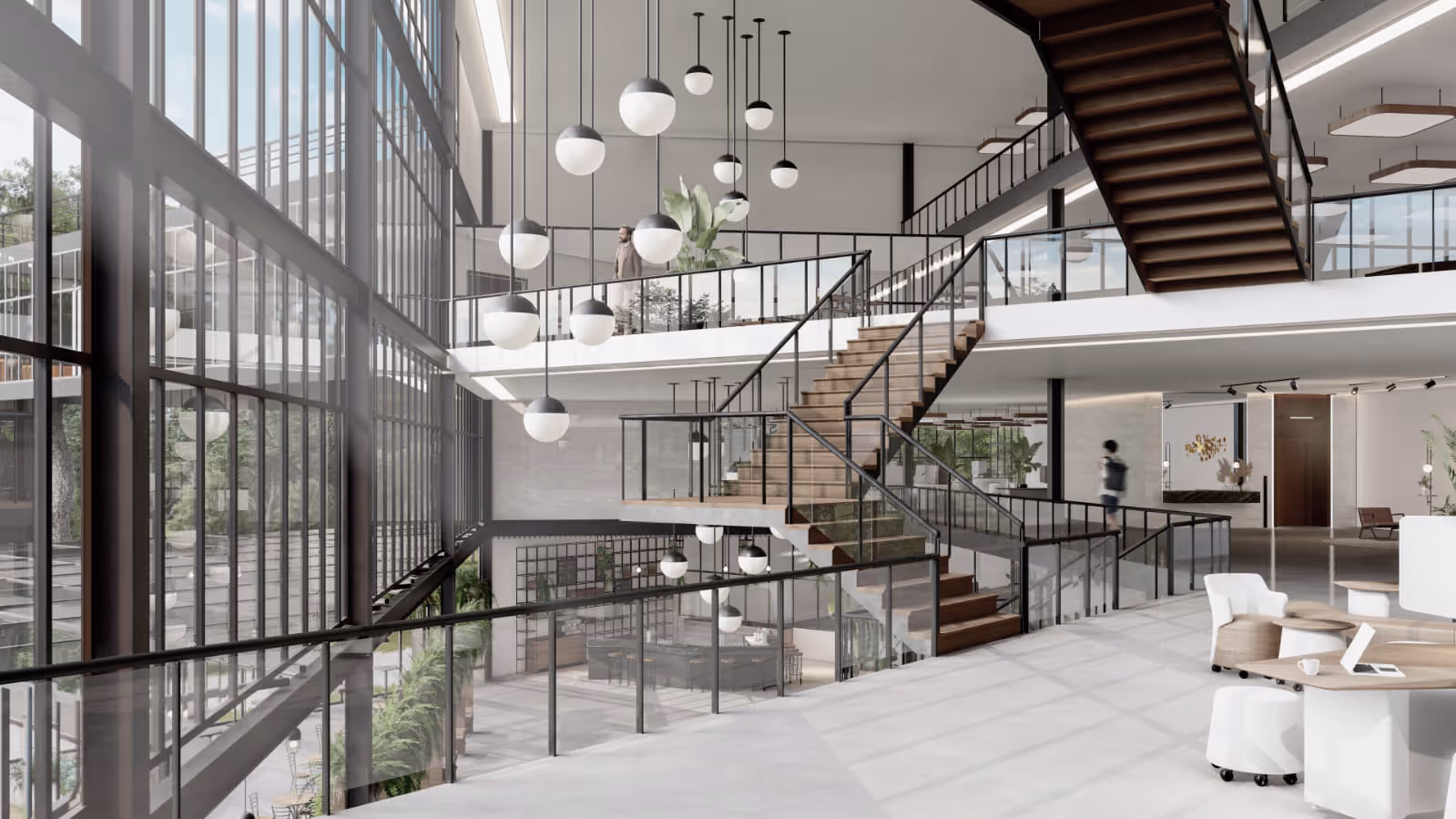
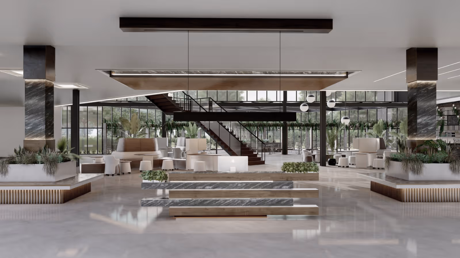
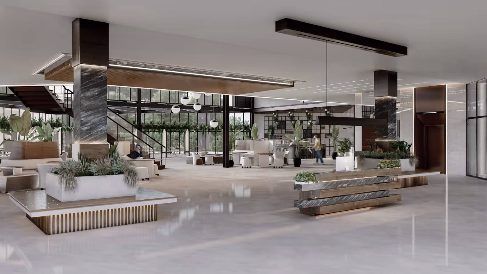
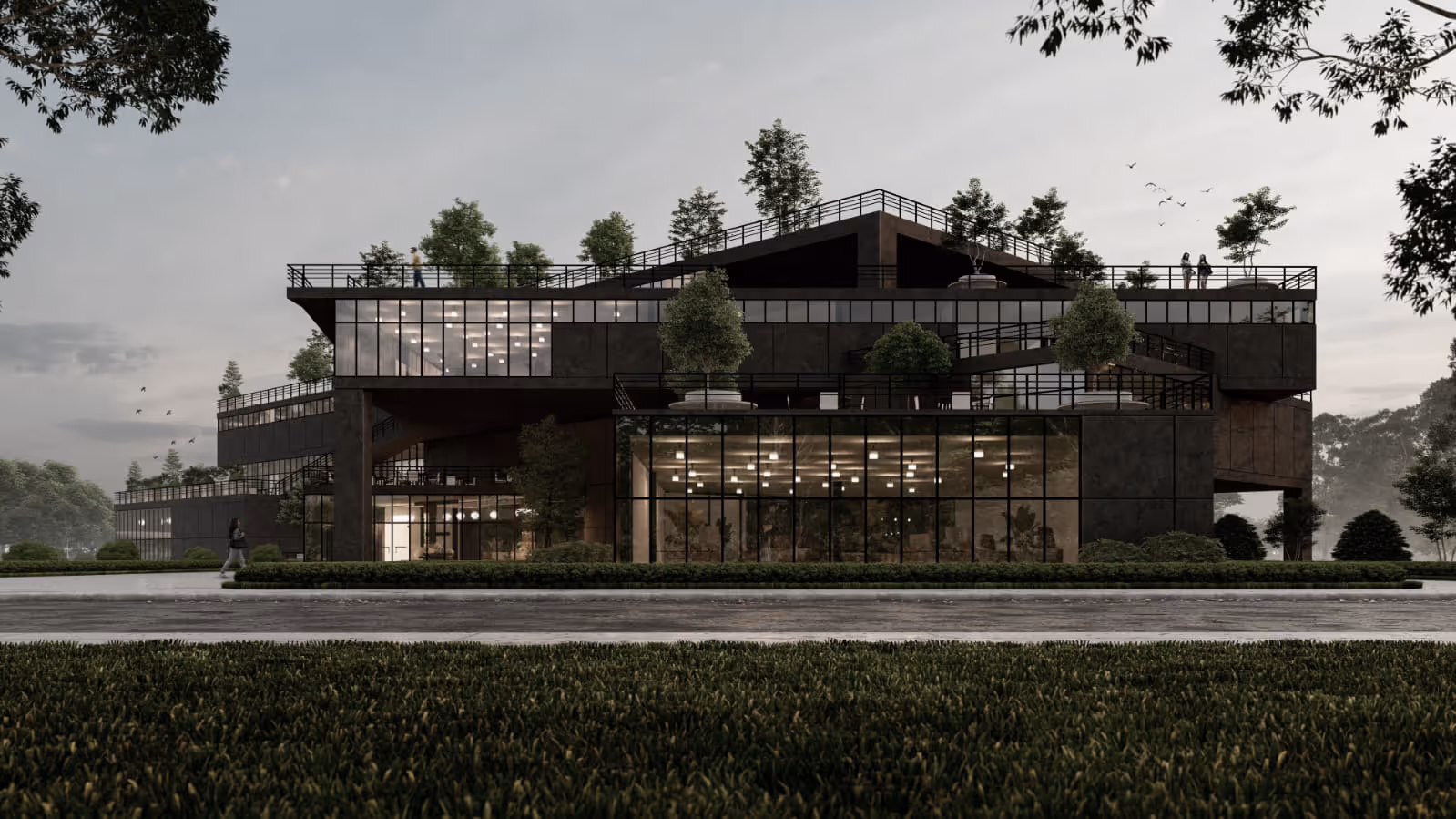
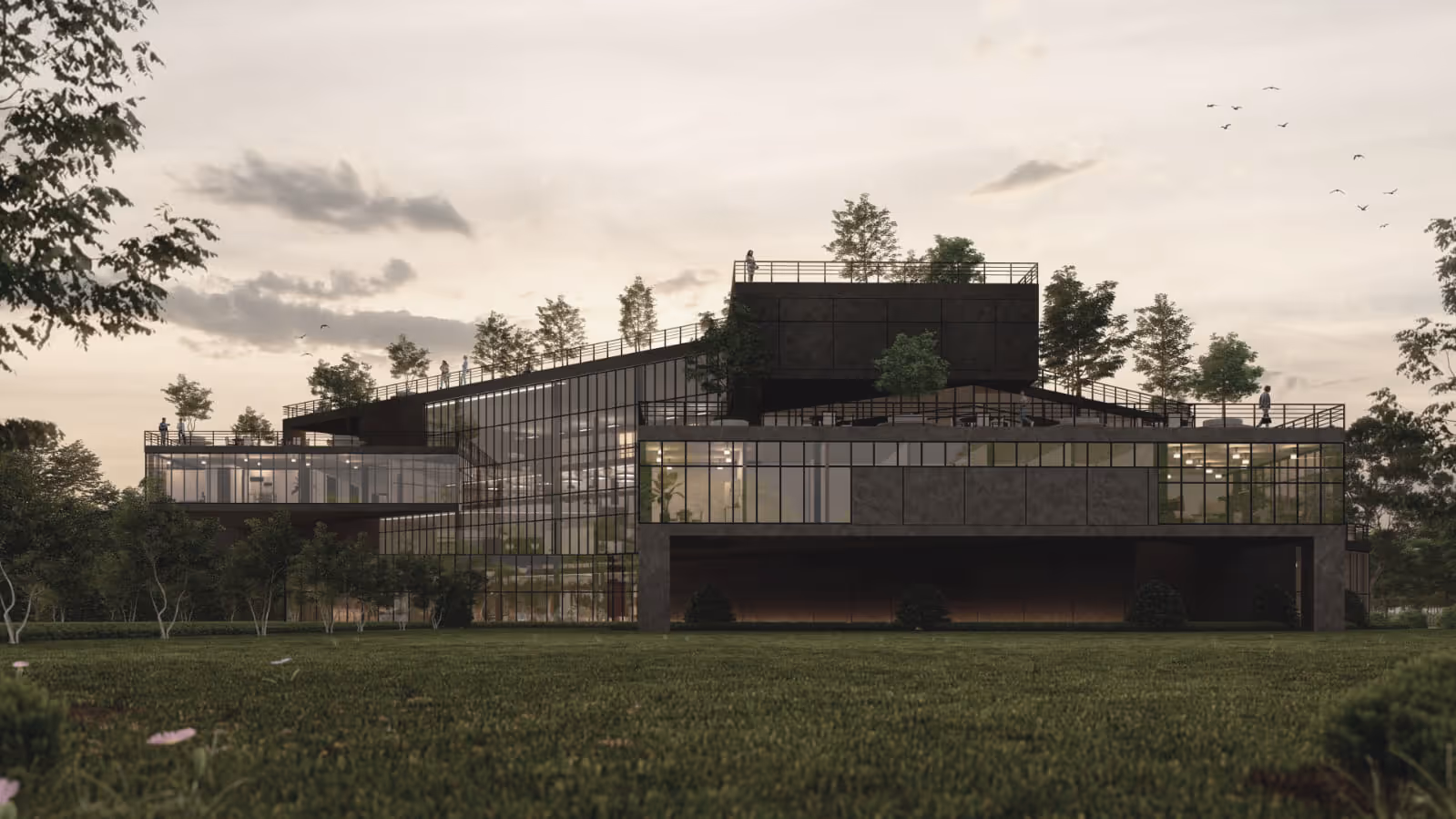
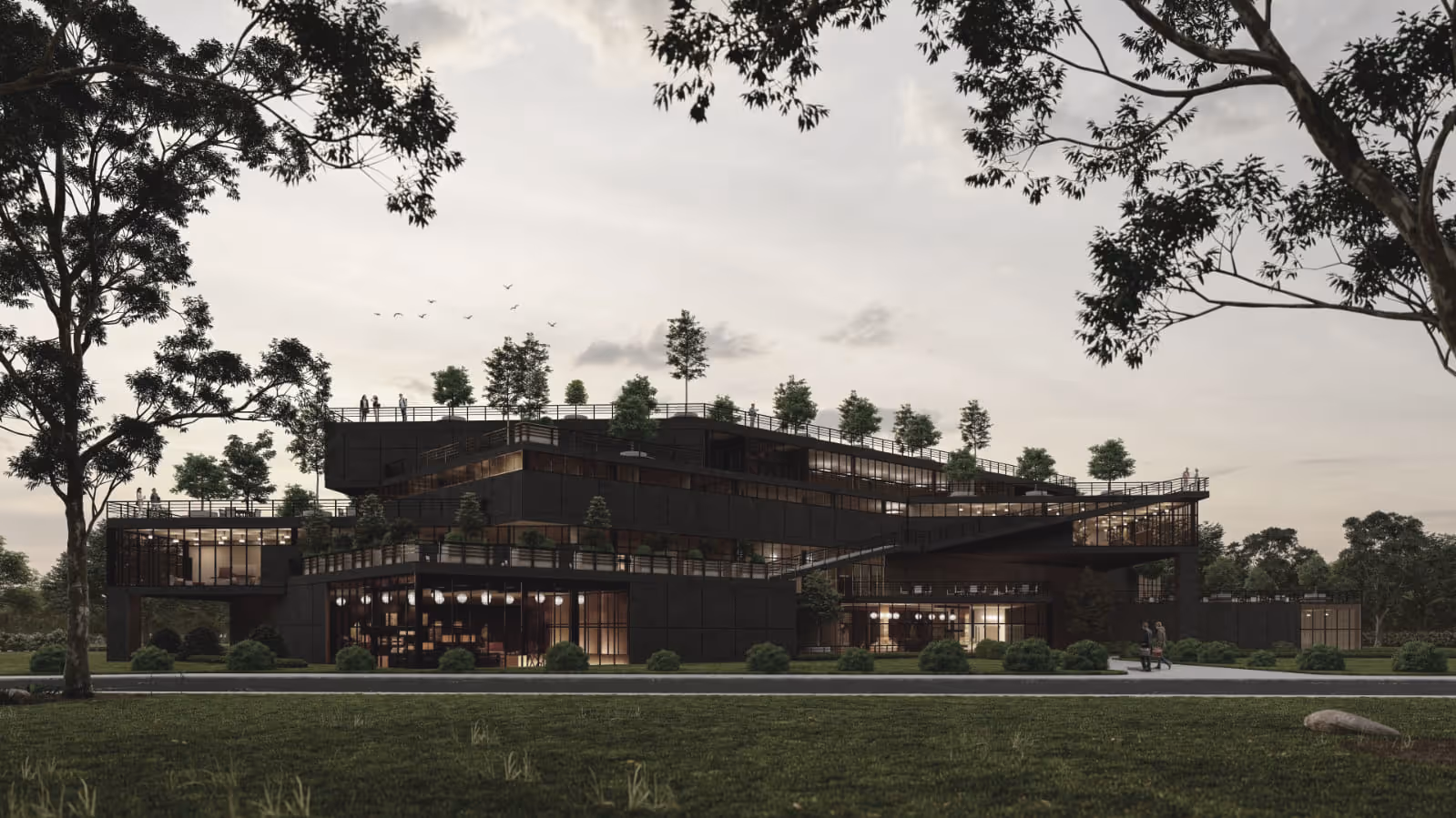
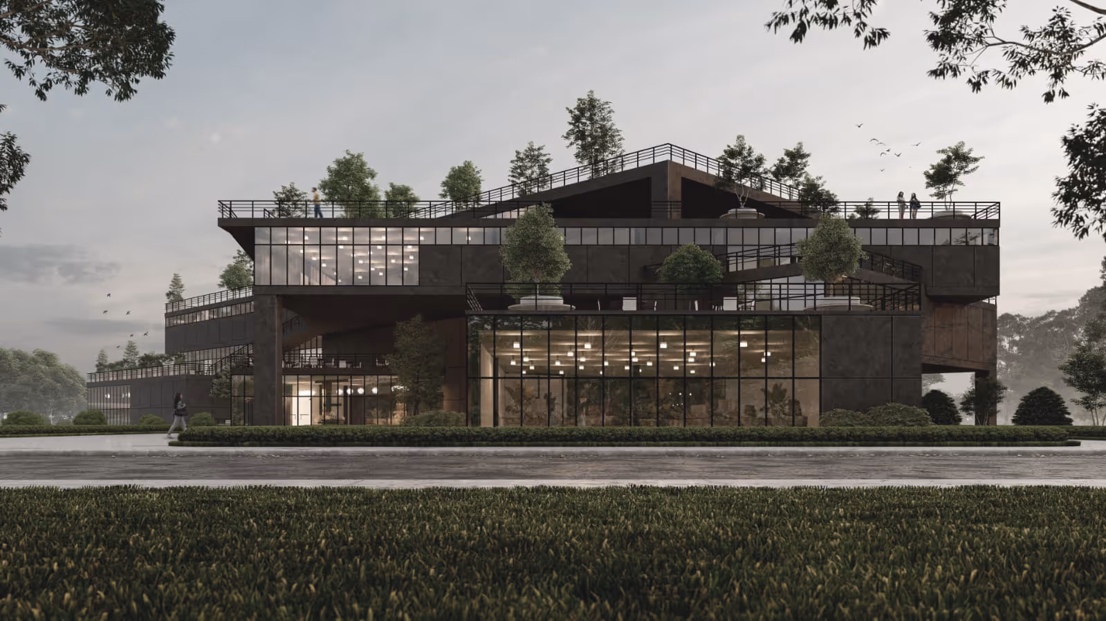
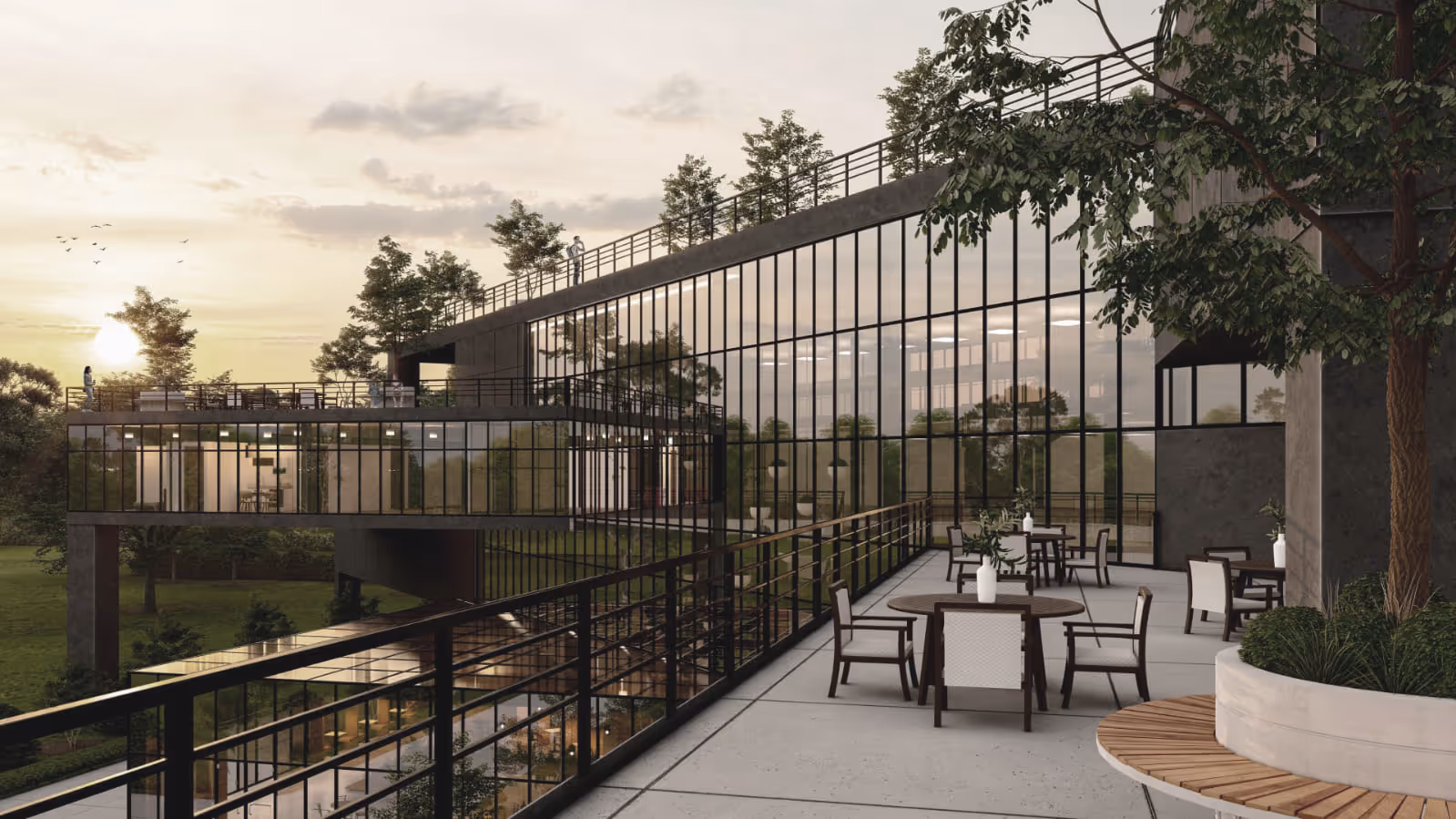
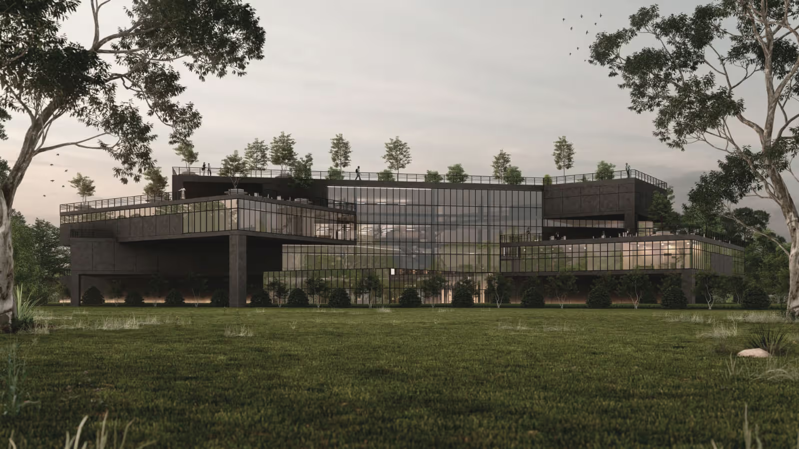
Set along the water’s edge, this co-working building is designed to blur the line between workplace and retreat. The architecture opens itself to the horizon—broad glass façades capture light and frame uninterrupted views of the waterfront, grounding the daily rhythm of work in a sense of calm and connection to nature.
The structure is defined by clean lines, natural materials, and a balance of solidity and transparency. Expansive windows and lofty interiors create bright, flexible spaces for collaboration, while quiet corners offer opportunities for focus and retreat. Exterior terraces extend the workplace outdoors, encouraging moments of pause and exchange against the backdrop of the water.
More than just an office, the building is a gathering place—designed to foster community, creativity, and flow—anchored in its unique waterfront setting.
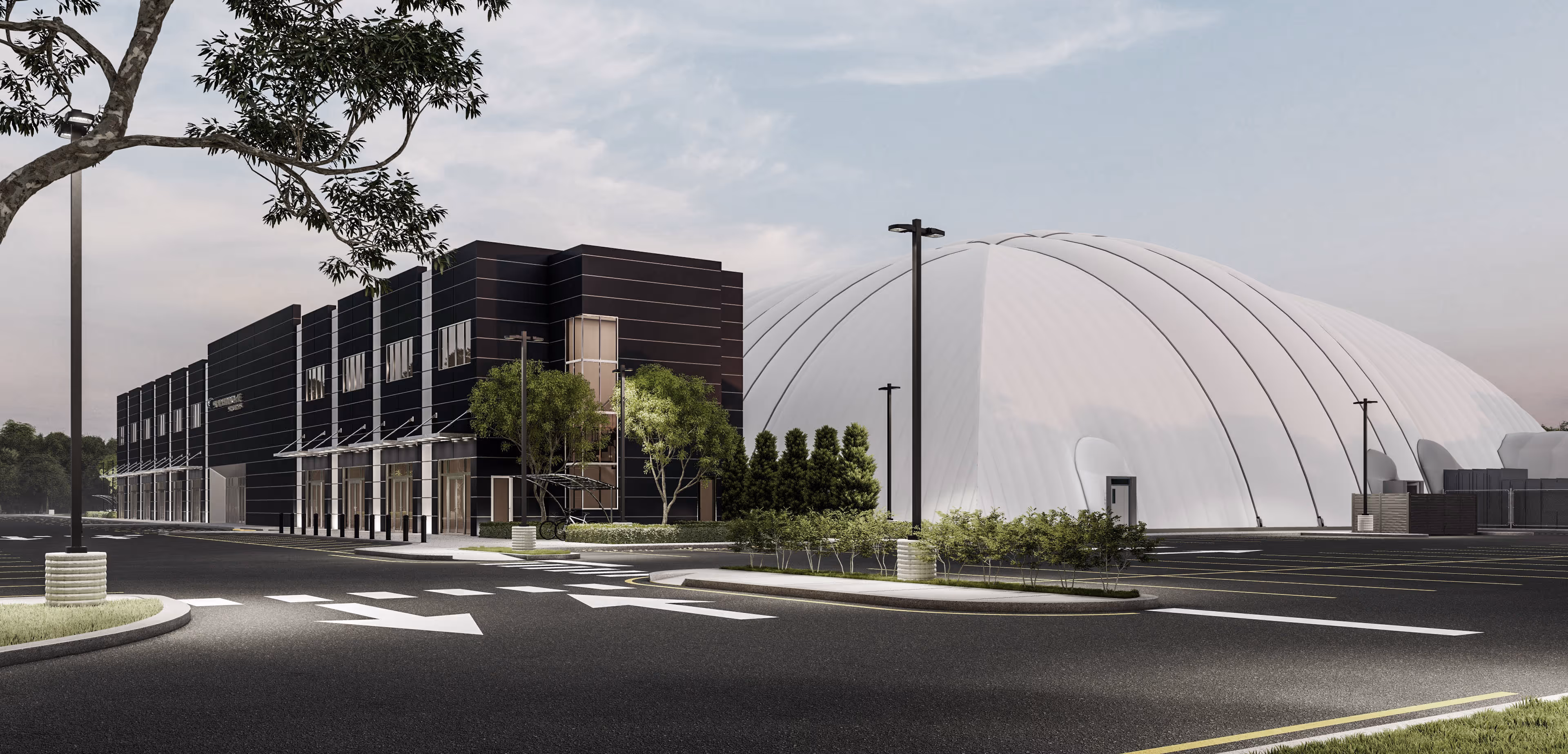

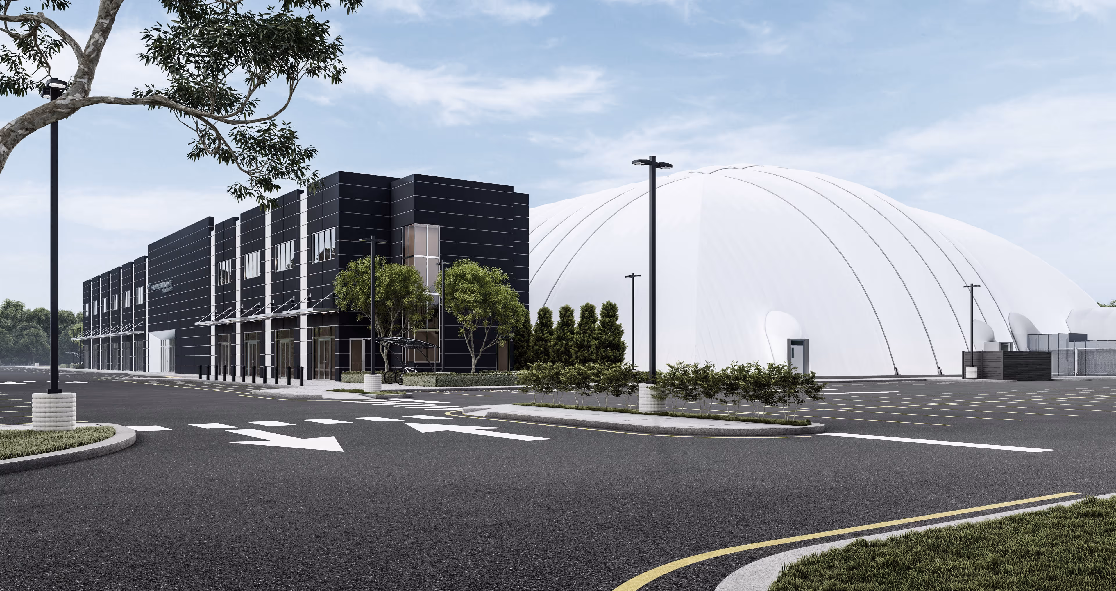
This project brings together modern design and active community life in a dynamic new sports complex. The centerpiece is the impressive dome structure, housing a full-sized playing field designed for year-round use. Its soaring, light-filled form creates an inspiring environment for both athletes and spectators, while its scale makes it a landmark presence on the site.
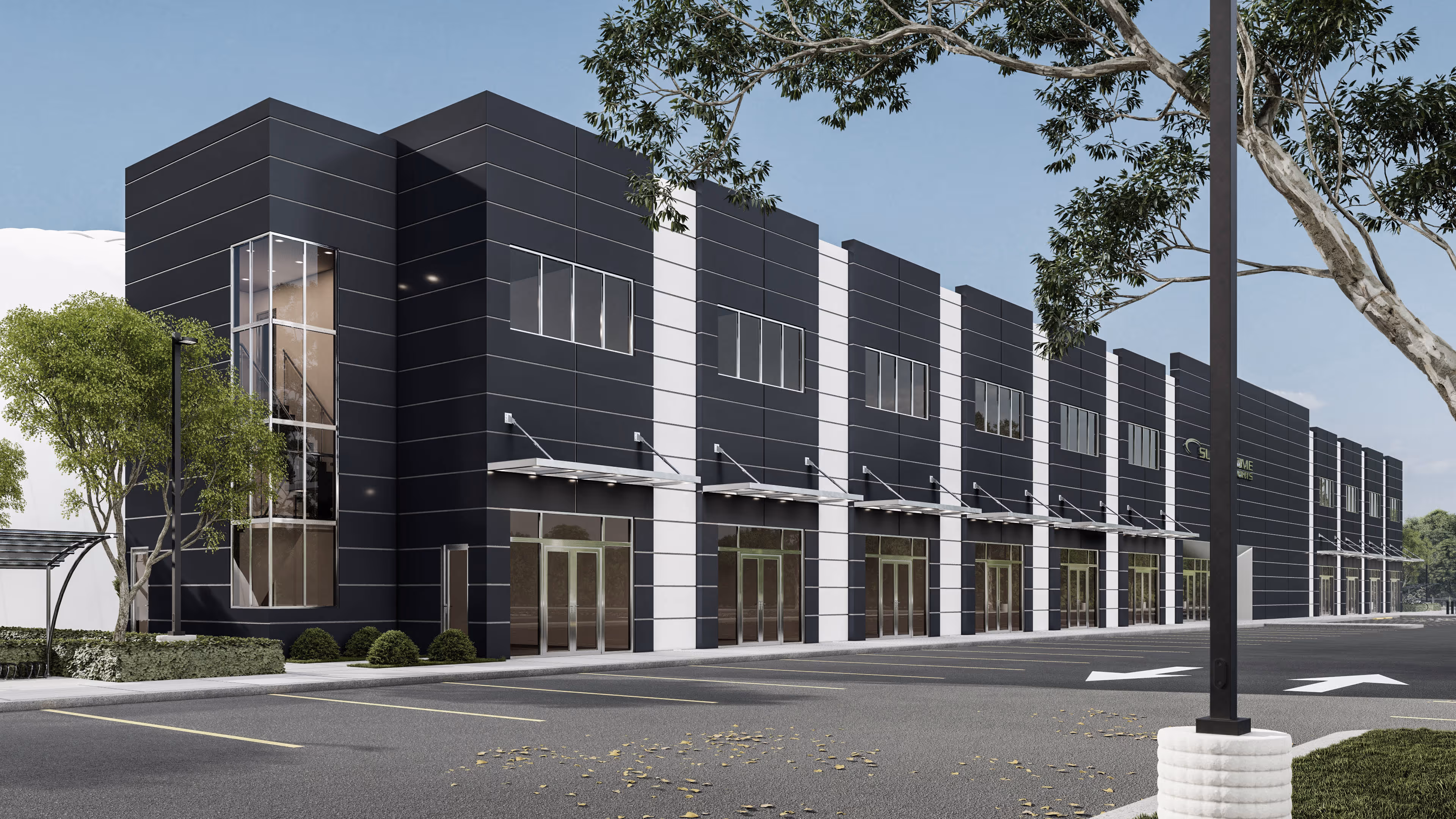
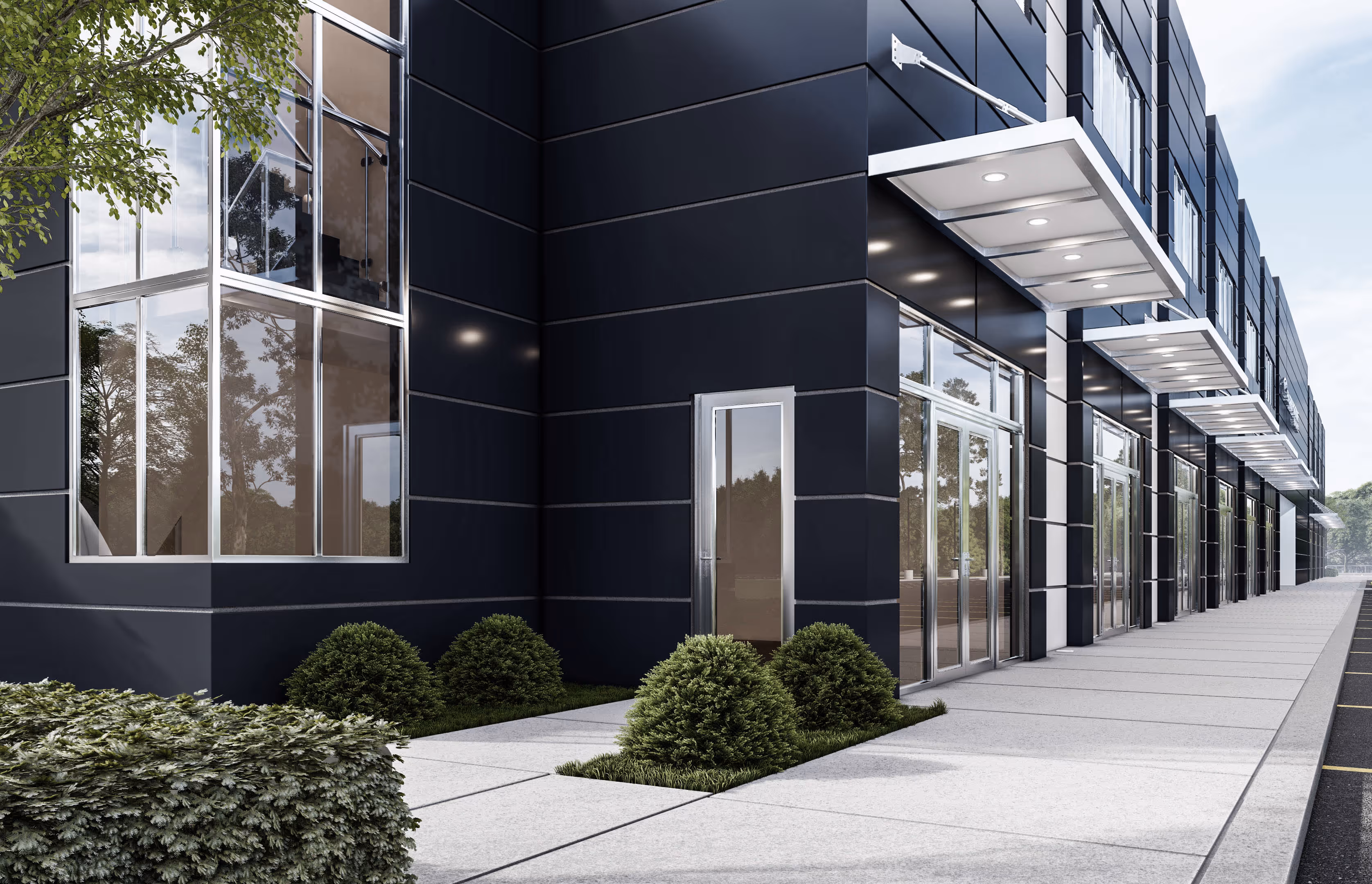
The front building anchors the complex with a sleek, contemporary exterior. Inside, it is thoughtfully programmed with everything needed to support the athletic experience—locker rooms, a snack bar, and gathering spaces. A dedicated party room adds flexibility, making the facility a destination not only for sports but also for celebrations and community events.
Surrounded by landscaping and set within a carefully planned site, the design balances utility and aesthetics. With clear circulation, ample parking, and welcoming entrances, the complex is both functional and inviting. This building captures a vision of recreation, connection, and community built around the shared love of sports.
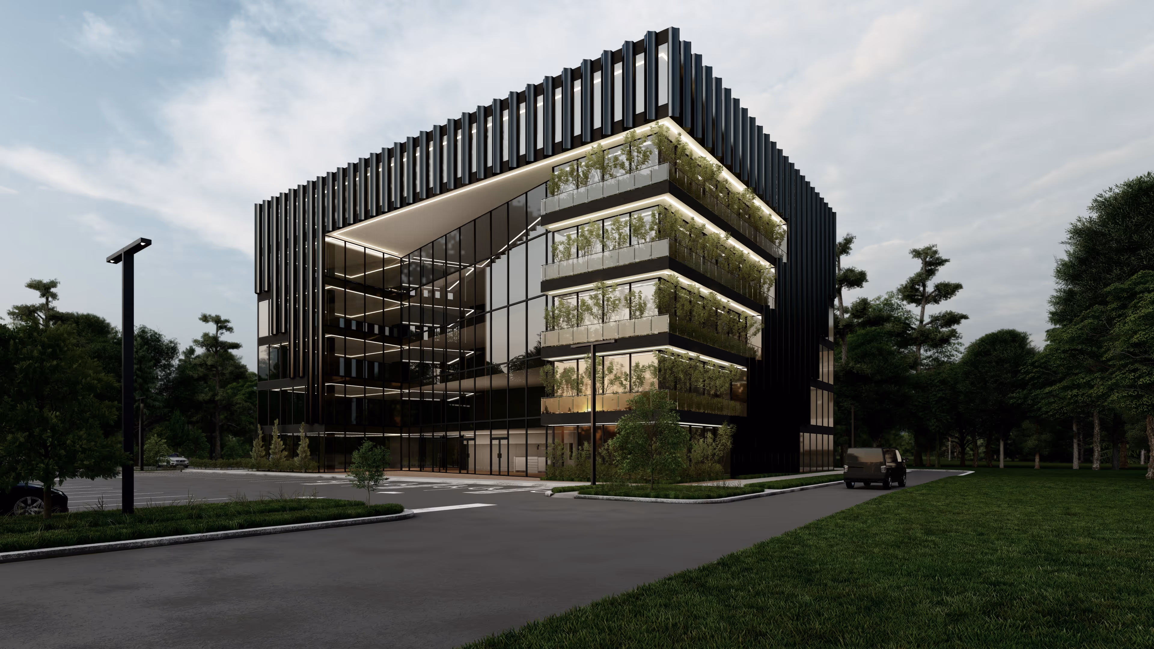
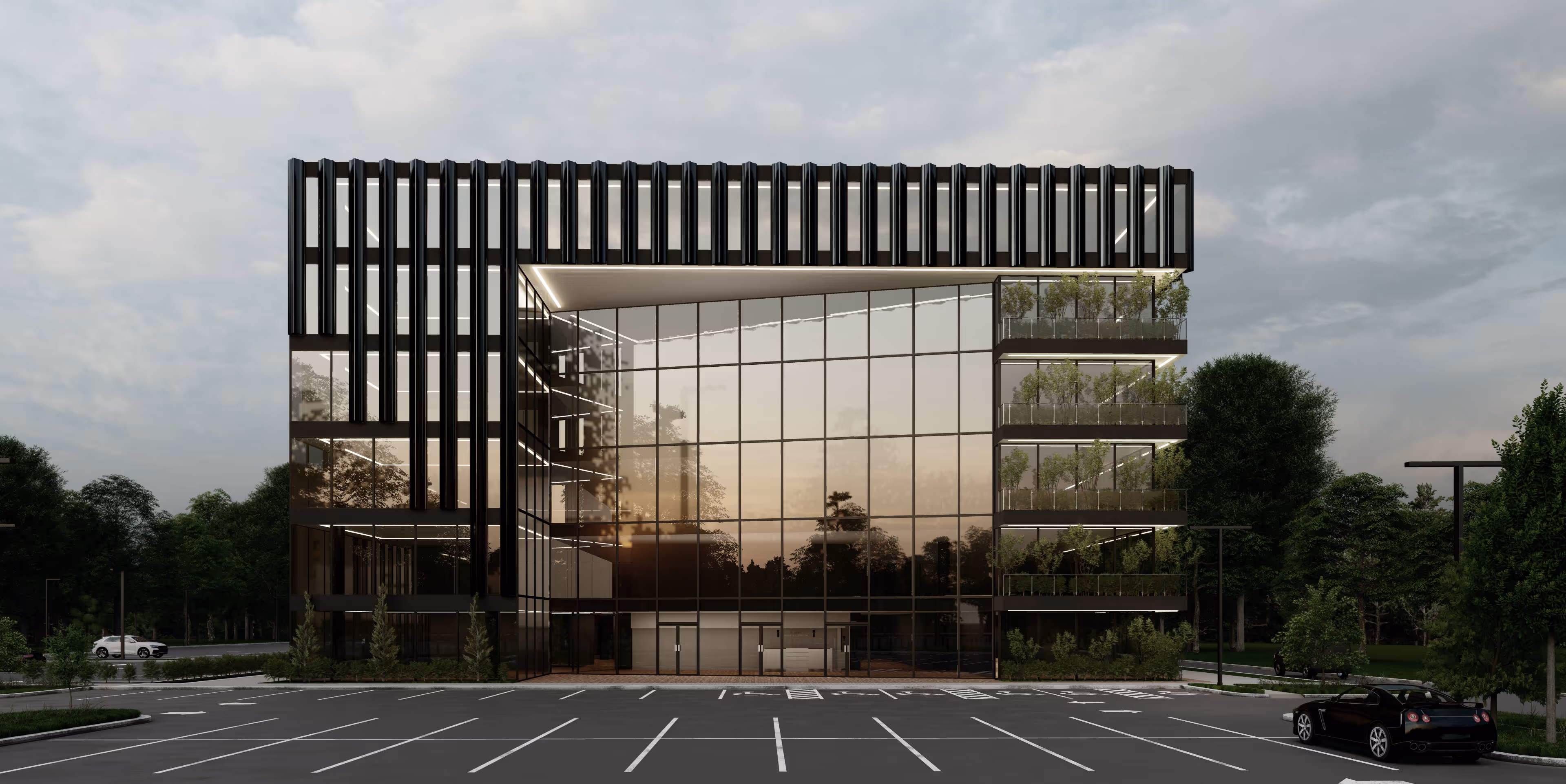
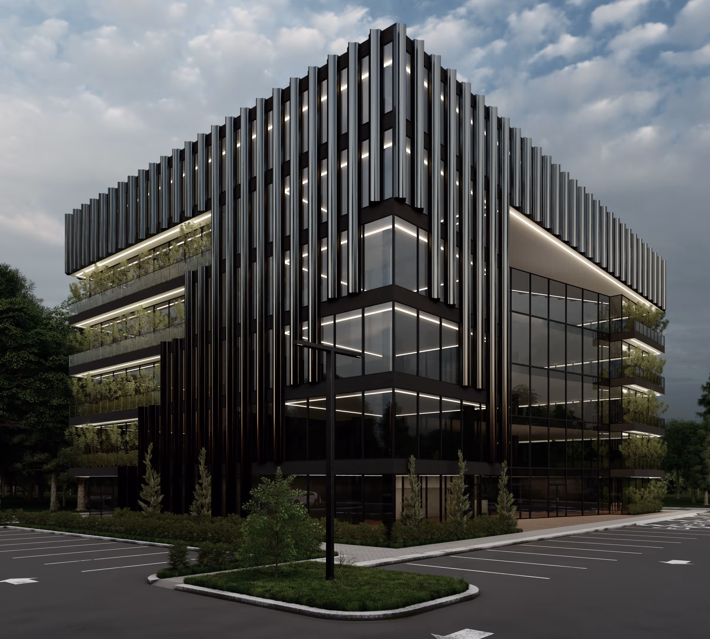
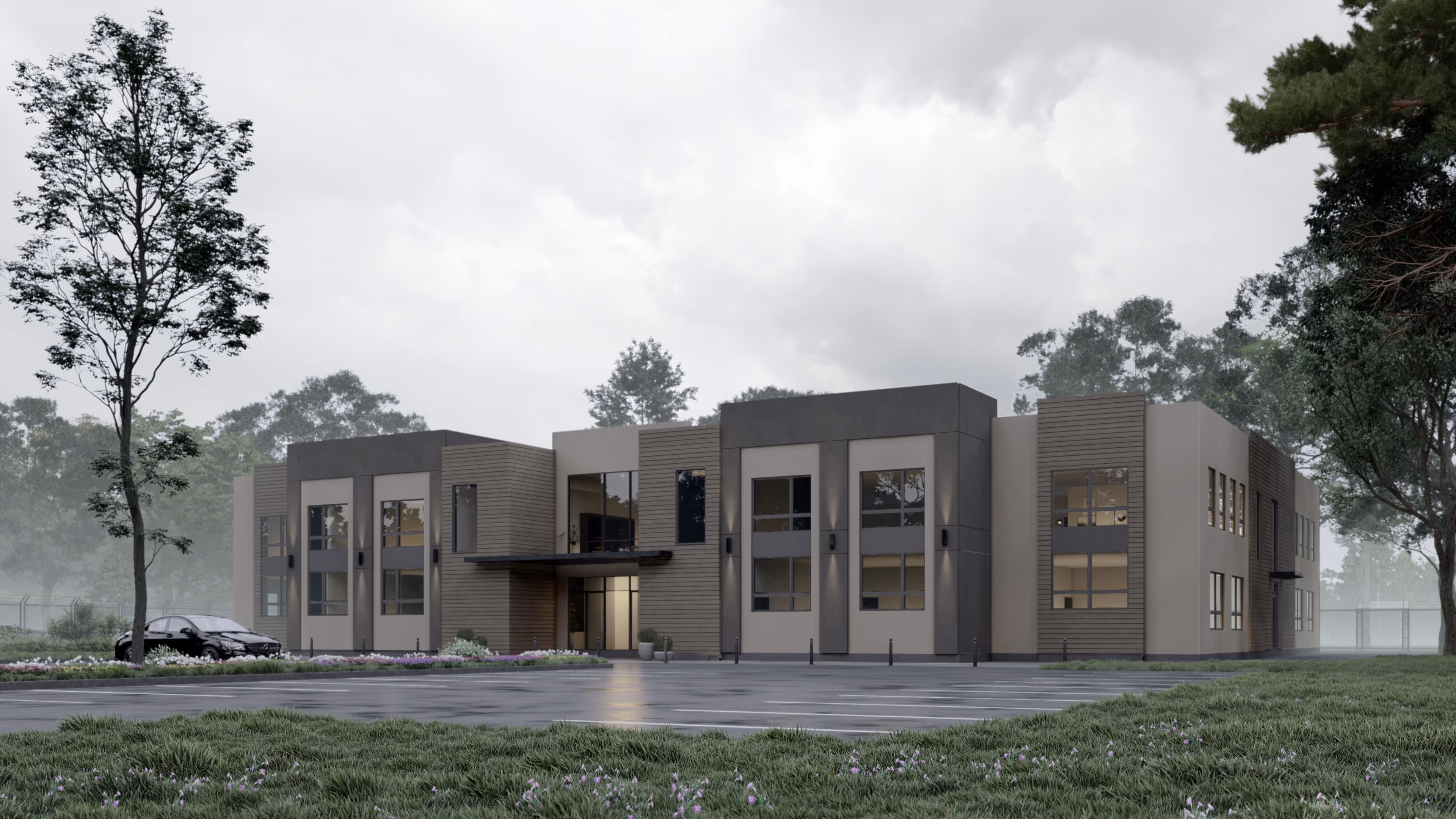
This office building was designed with a sleek, modern aesthetic that emphasizes clean lines and strong geometry. The exterior features a refined mix of dark gray masonry and expansive glass, creating a bold yet sophisticated presence. Vertical window groupings accentuate the façade, balancing rhythm and light while maintaining privacy where needed.
A striking corner element with full-height glass opens the building to natural daylight and creates a welcoming entry point. On the upper level, a terrace with glass railings extends the workspace outdoors, offering flexibility for meetings or breaks in a fresh, open-air setting.
This project reflects a forward-looking approach to workplace design, where modern architecture and practical use come together to create a standout office destination.
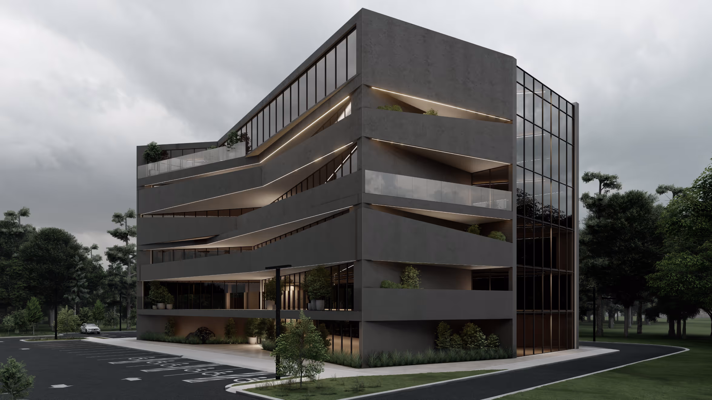
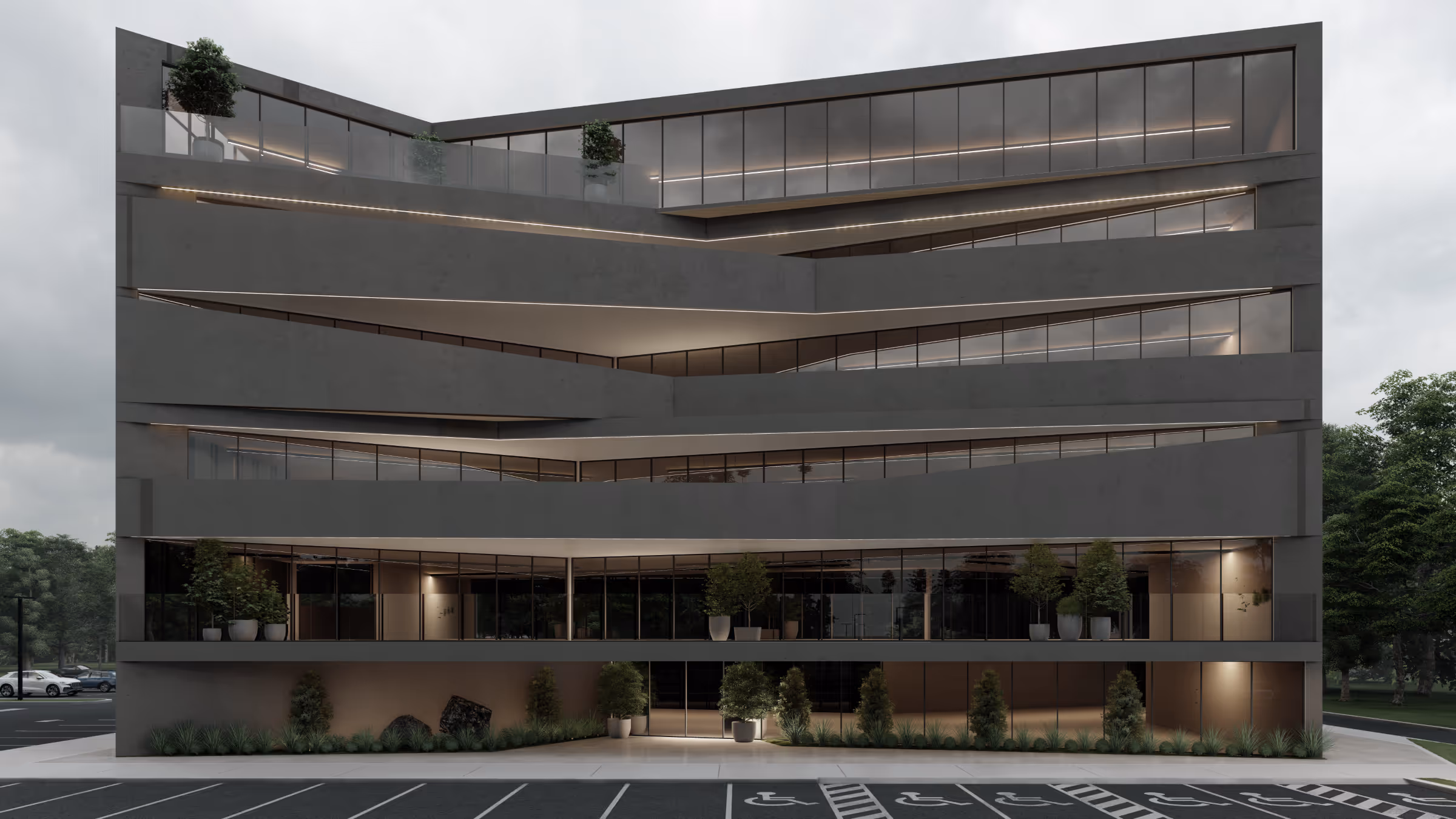

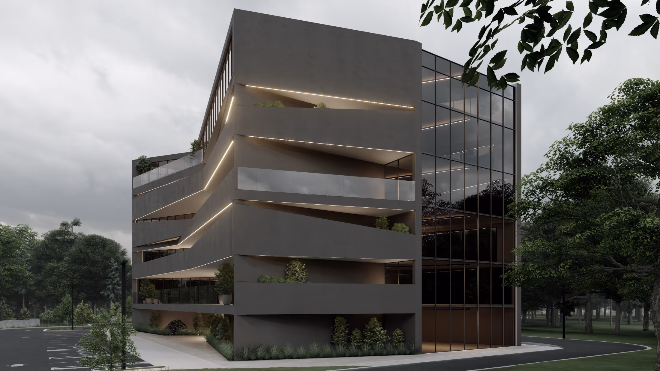
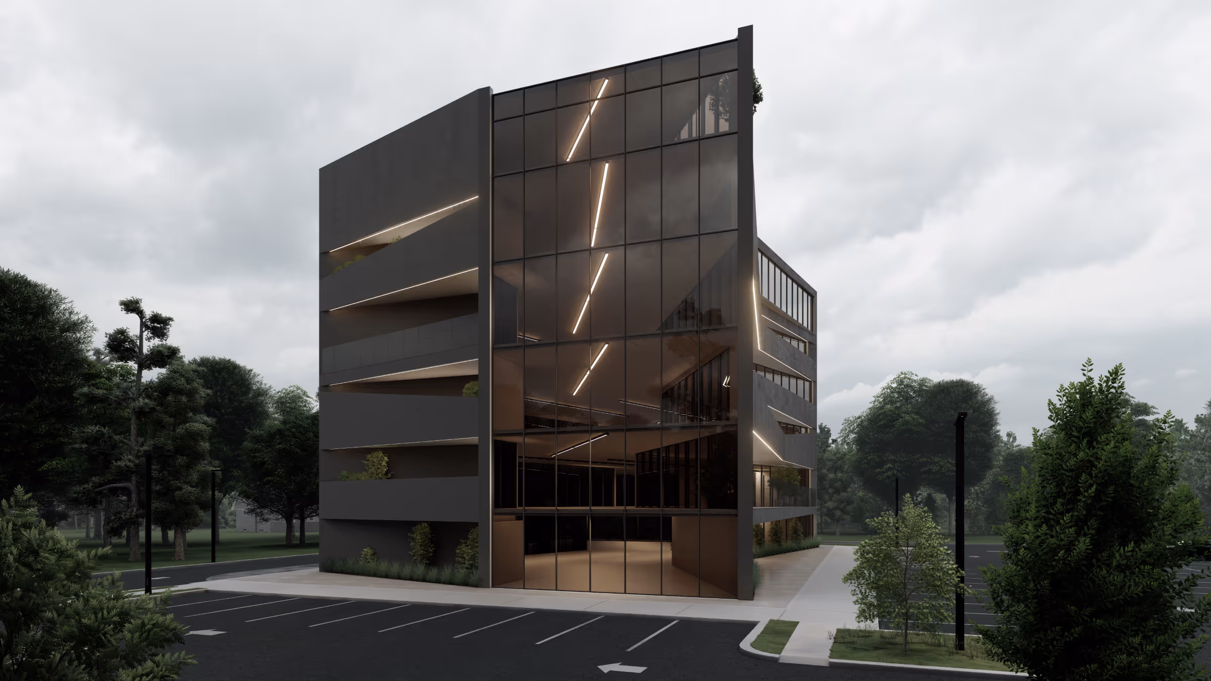
This office building is defined by movement and mass. Its sculptural form feels carved rather than assembled, with concrete planes cut on the diagonal to reveal continuous bands of glass. These angled cuts bring light deep into the floors, softening the structure and giving each level its own character.
The design unfolds in layers that shift and respond to the site. From the street, the building appears both grounded and dynamic—still, yet in motion. Planters and greenery are built into the façade, connecting the architecture to its surroundings and softening the rigor of the form.
The palette is minimal, but carefully detailed. The result is calm and precise—an everyday workplace elevated through clarity and restraint.
A retail ensemble composed not as repetition, but as rhythm. Six distinct spaces, unified by purpose yet each allowed its own voice.
This project unfolds as a series of thresholds—each bay carefully considered, articulated through a shifting palette of texture and material. Wood, tile, stucco, brick, and CMU each play their part, grounding the structure in variation without dissonance. The base is held in brick—a tactile anchor—while two spaces express their mass more deliberately in exposed CMU, offering contrast through weight and shadow.
The design avoids monotony, instead focusing on nuance. Small changes in finish and proportion give each unit its own character while keeping the overall composition consistent.
.jpg%20edit.avif)
.jpg%20edit.avif)
.jpg%20edit.avif)
.jpg%20edit.avif)
This office building presents a contemporary design defined by clean geometry, glass expanses, and contrasting natural materials. Vertical wood slats, polished stone, and dark accents give the exterior a crisp, modern profile. Inside, soaring double-height spaces bring in natural light, balanced by warm wood finishes and textured walls for a sense of refinement.
The design emphasizes both function and experience, offering lounge areas, collaborative workspaces, and landscaped outdoor zones that make the building as comfortable as it is professional.
.jpg%20edit.avif)
.jpg%20edit.avif)
.jpg%20edit.avif)
.jpg%20edit.avif)
.jpg%20edit.avif)
.jpg%20edit.avif)
.jpg%20edit.avif)
.jpg%20edit.avif)
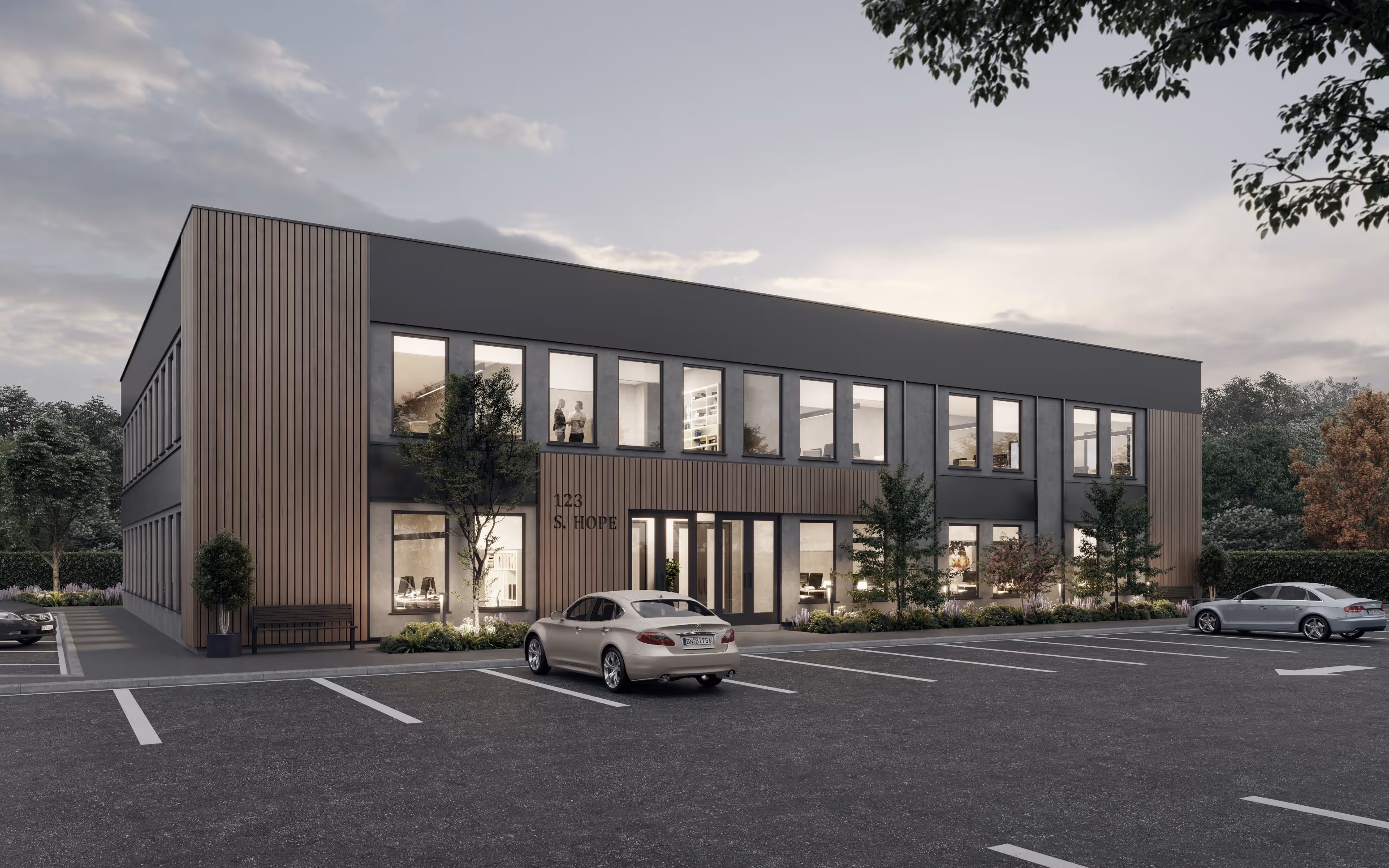
This two-story office building balances a professional presence with a warm, approachable character. Large windows animate the façade, drawing daylight deep into the interior and offering transparency between workspaces and the surrounding landscape. Vertical wood cladding softens the clean lines of the dark exterior, grounding the building in natural texture and contrast.
Within, flexible layouts accommodate a range of tenants, from medical suites to professional offices, each space benefiting from the natural light and orderly proportions established by the architecture. The entry sequence is framed with planting and scale, creating a welcoming threshold that bridges the workplace with its wooded context.
The result is a building that feels modern, inviting—crafted to support productivity.
.jpg%20edit.avif)
At first glance, Little People delights with playful gestures, but every element is carefully considered—shaped by regulation, scale, and the needs of young children. The design centers on its smallest users, ensuring that the building responds to them rather than simply accommodating them.
The entry sequence makes this focus immediately clear: a door at child height welcomes children on their own terms. Inside, low fixtures, child-sized bathrooms, and soft materials promote independence and safety, with every detail deliberate and purposeful.
Colorful house-shaped frames animate the stucco façade and, inside, transform into window seats—nooks for reading, observing, or daydreaming. These playful interventions are integrated into the architecture, enhancing both function and experience.
A building defined by rhythm and light. This corporate headquarters is composed as a series of contrasts—glass and metal, structure and void, openness and enclosure.
Vertical fins create a deep grid along the façade, introducing a cadence that both shades and defines. At the center, a recessed void breaks the massing, drawing the eye inward and flooding the interior with natural light. The entry sequence is understated but intentional—a moment of pause before arrival.
On one side, tiered garden terraces introduce softness and life to the upper levels, allowing each floor to engage directly with nature. Reflections on the glazed façade fold the surrounding landscape into the architecture, blurring the line between object and environment.
The office building takes shape around two very different functions, brought together in a single, unified form. From the street, its clean volumes and symmetrical composition give it a clear presence, but the materials—horizontal siding, smooth panels, and generous glazing—keep it approachable. At the back, the daycare occupies a quieter space, where openness is balanced with privacy and light is carefully guided to soften transitions between areas. Thoughtful and restrained, the building doesn’t reveal everything at once, instead letting its design quietly support the diverse needs within.
.jpg%20edit.avif)
.jpg%20edit.avif)
.jpg%20edit.avif)
.jpg%20edit.avif)
.jpg%20edit.avif)
A space designed to linger in memory as much as inexperience. Seared was envisioned as a bold, immersive dining environment—where lighting, materiality, and spatial choreography converged to elevate the atmosphere beyond the expected.
The entry unfolds in dramatic curves and texture—an illuminated stair, cascading pendants, and dark stone surfaces that draw you inward. A palette of charred tones, deep greens, and soft metallics threads throughout the space, anchoring the design in warmth and sophistication. From sculptural ceiling installations to custom millwork and built-in banquettes, every detail was crafted to heighten both intimacy and impact.
Seating spanned two floors, with a custom dumbwaiter system discreetly supporting kitchen efficiency across levels. While the original concept was unapologetically ambitious, the space remains a testament to the power of vision: how design can create a setting that feels rare, focused, and transportive—even if its story takes an unexpected turn.
Now under new ownership, the interior continues to serve as a striking foundation—ready to be reinterpreted, yet unmistakably original.
.jpg%20edit.avif)
.jpg%20edit.avif)
.jpg%20edit%20(3).avif)
.jpg%20edit.avif)
.jpg%20edit%20(1).avif)
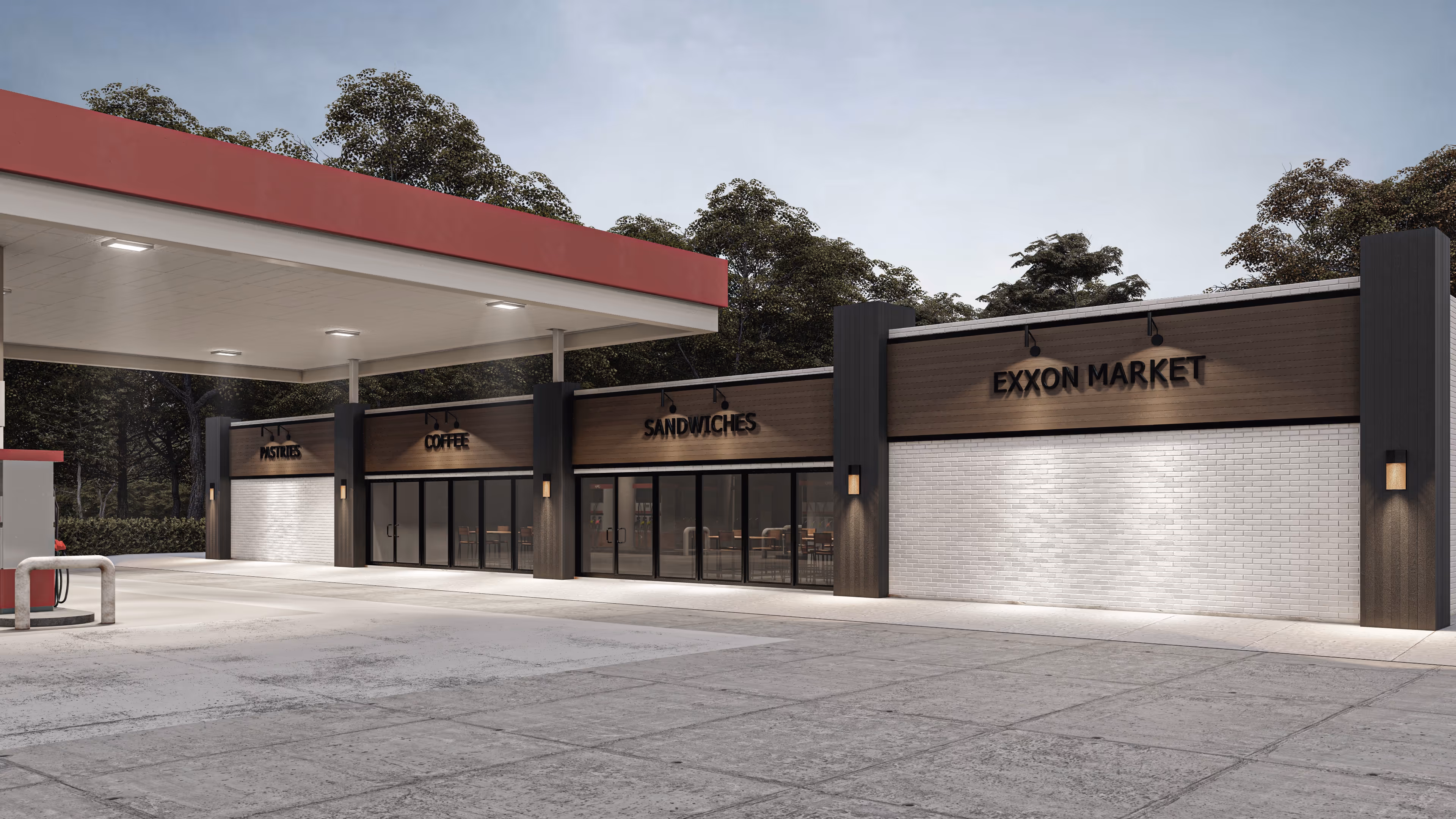
Anchored by white brick and warm wood siding, this Exxon Market exudes a welcoming presence. Clean horizontal lines and dark vertical accents frame the storefronts with a modern edge, while expansive glass panels create openness, connecting the interior activity to the forecourt.
Thoughtful lighting highlights the textures of the façade, ensuring the building feels safe and inviting both day and night. Positioned in a prime location, the design elevates the everyday stop into an experience that feels streamlined, contemporary, and approachable.
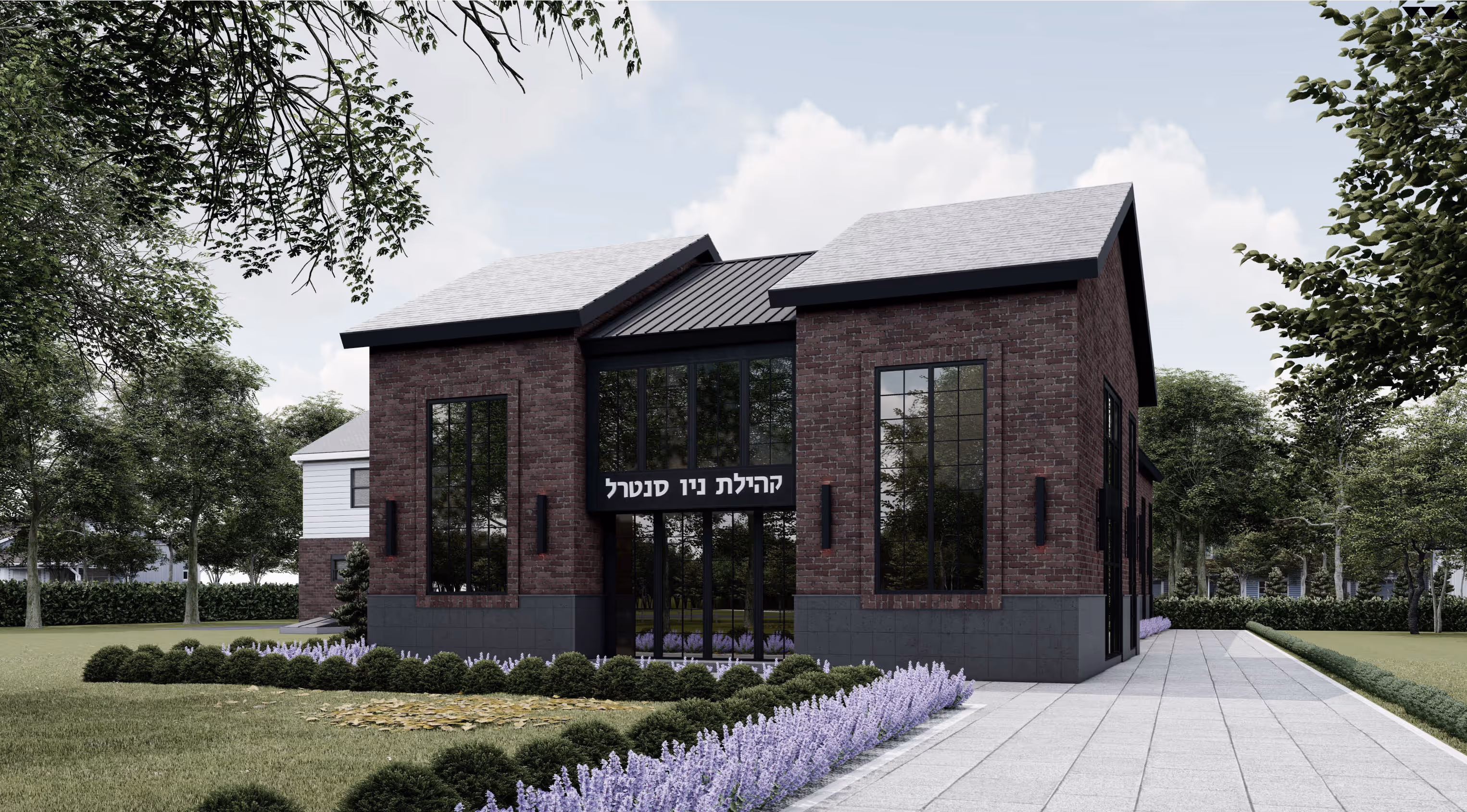
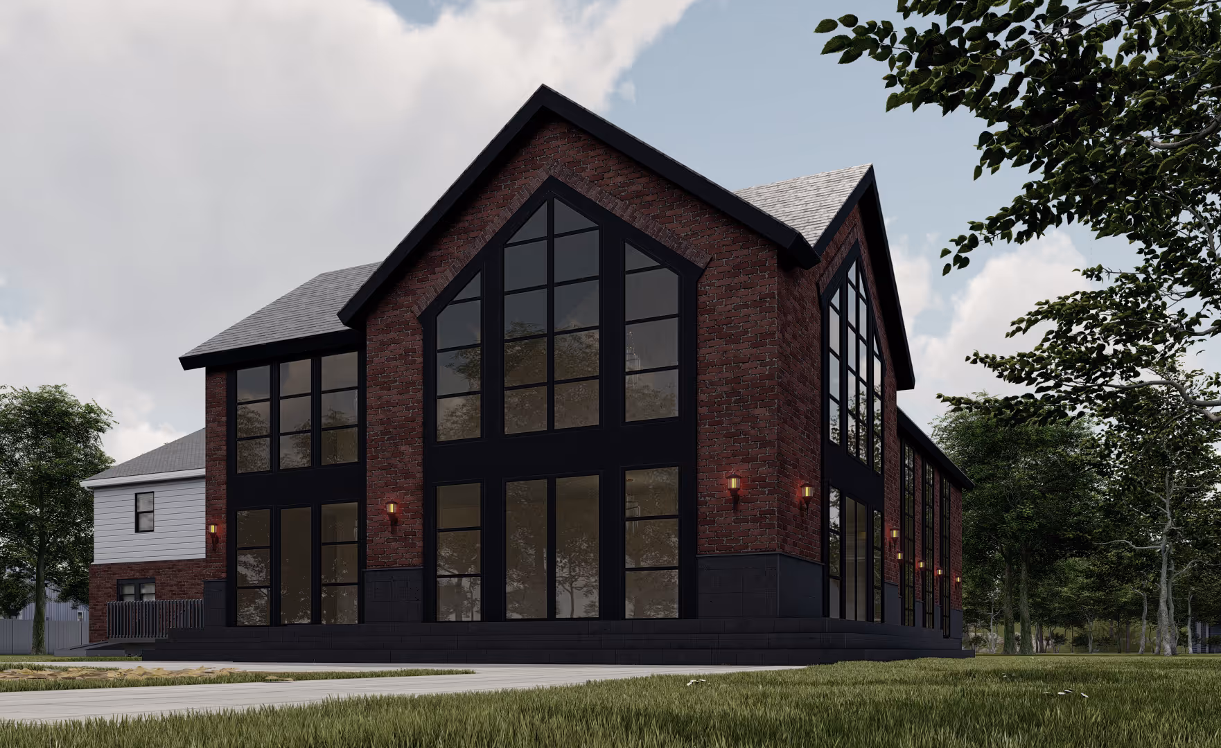
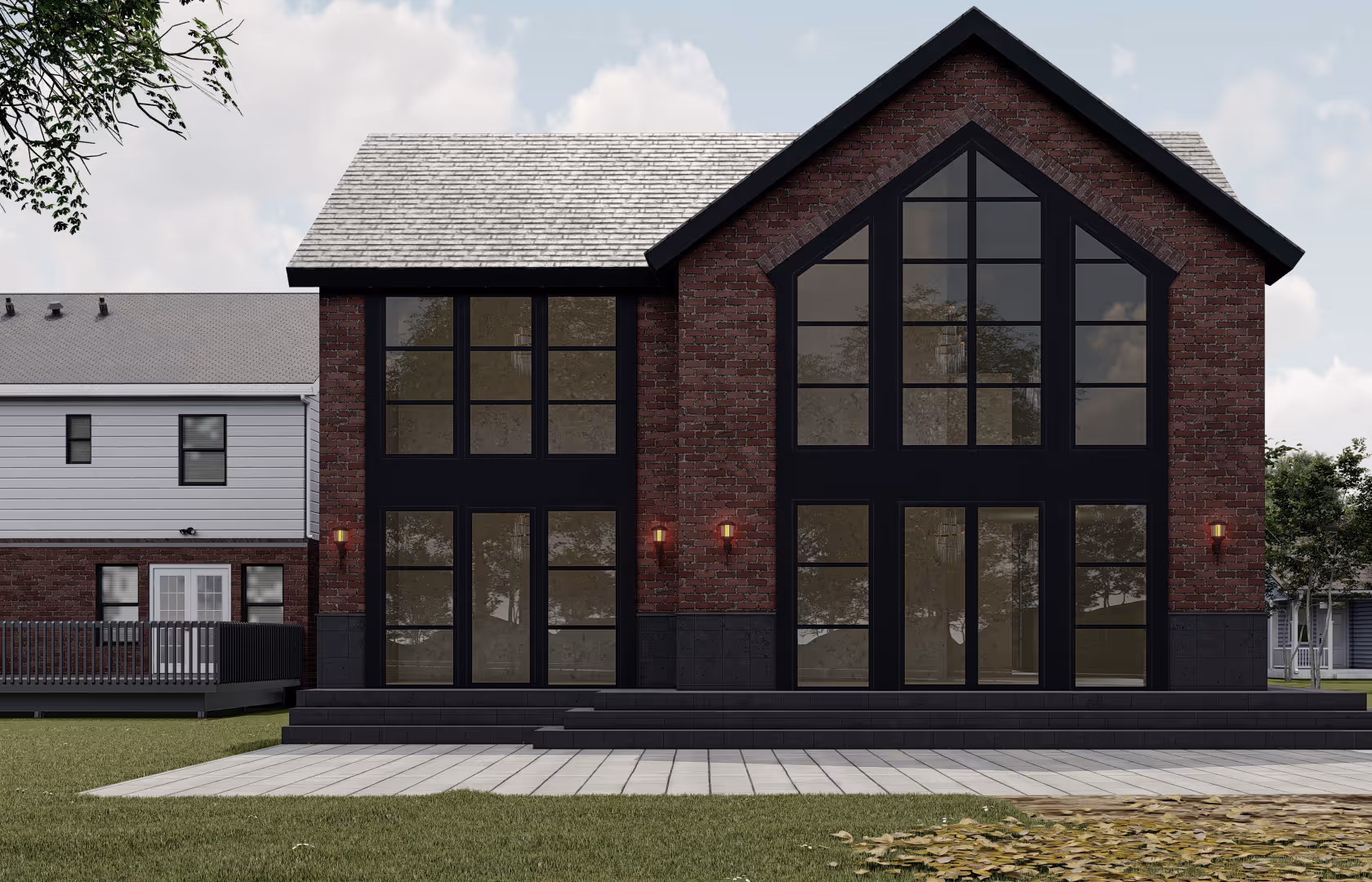
The congregation’s steady growth brought with it the need for more space, and with it, an opportunity to reimagine their home. What began as a house has now been transformed into a striking shul, with twin gabled forms flanking a glass entry that welcomes light.
Red brick, dark trim, and tall windows create a balance of tradition and modernity, while the symmetry of the façade lends a sense of dignity and permanence. The design not only increases capacity but also strengthens the presence of the shul within the community—both familiar and distinctly renewed.
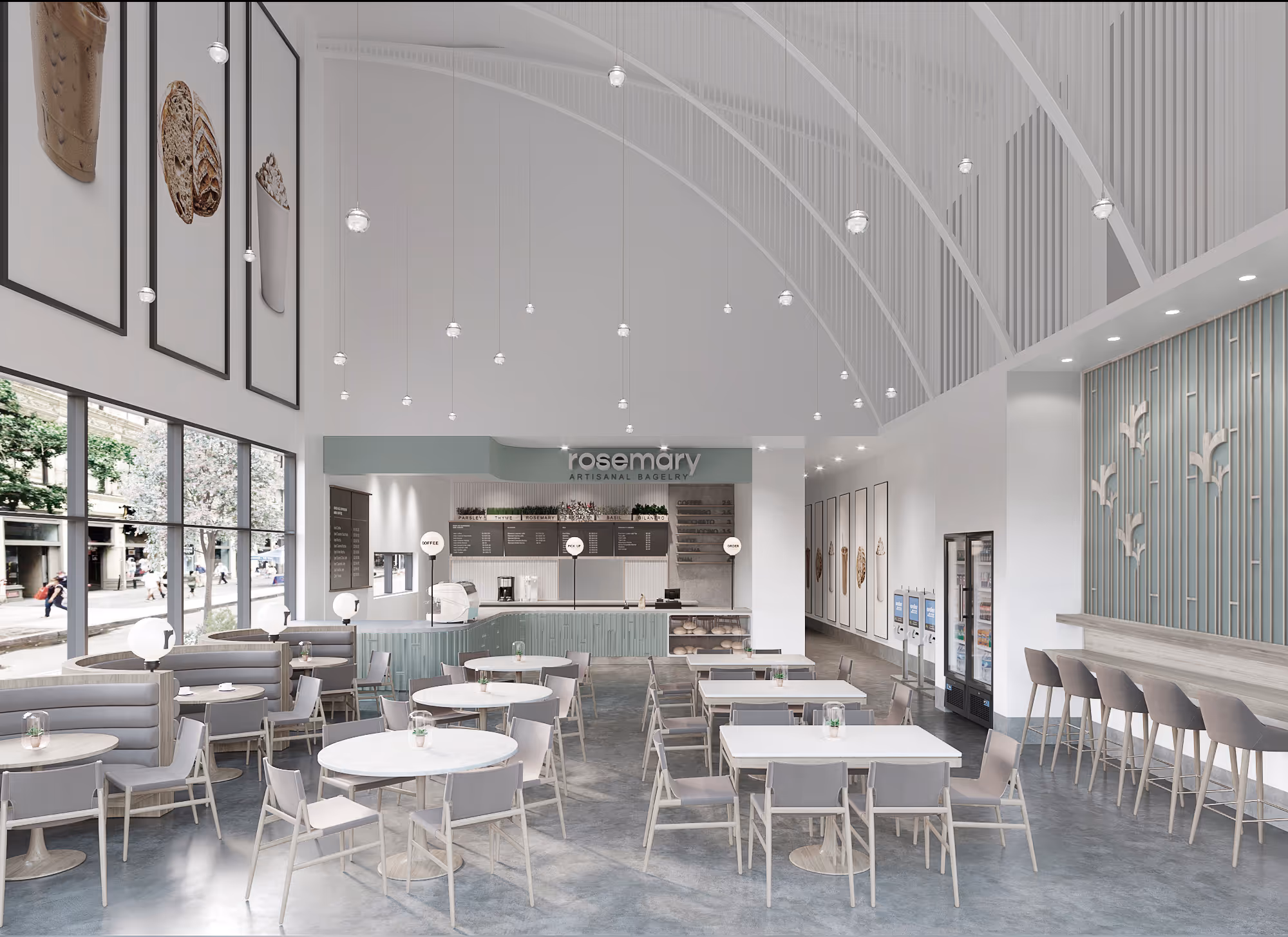
This café fit-out is designed as light, fresh, and intentional as the food it serves. A vaulted ceiling arcs overhead, its white ribs pulling the eye upward and amplifying a sense of openness. Natural light washes in through the full-height storefront, illuminating a palette of soft greens, pale woods, and muted grays—tones chosen to feel both contemporary and welcoming.
The layout balances efficiency with atmosphere: a clean counter line anchors the space, while custom banquettes, bar seating, and café tables offer varied settings for gathering. Vertical accents—whether in the slatted feature wall or the rhythmic hanging lights—lend subtle texture and rhythm without overwhelming the room.
The result is a space that feels airy yet grounded, crafted to elevate the everyday ritual of coffee and bagels into something quietly memorable.
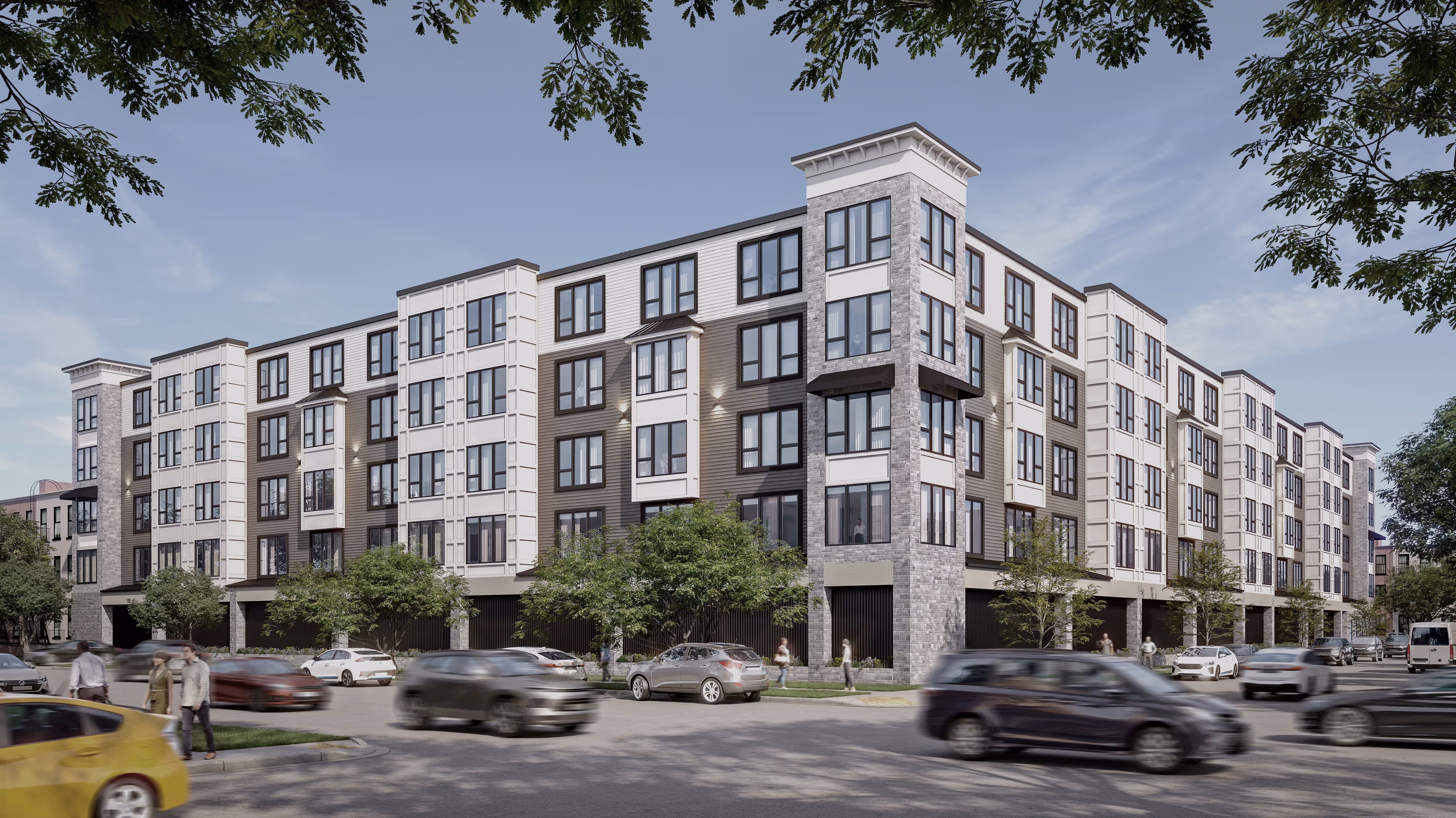
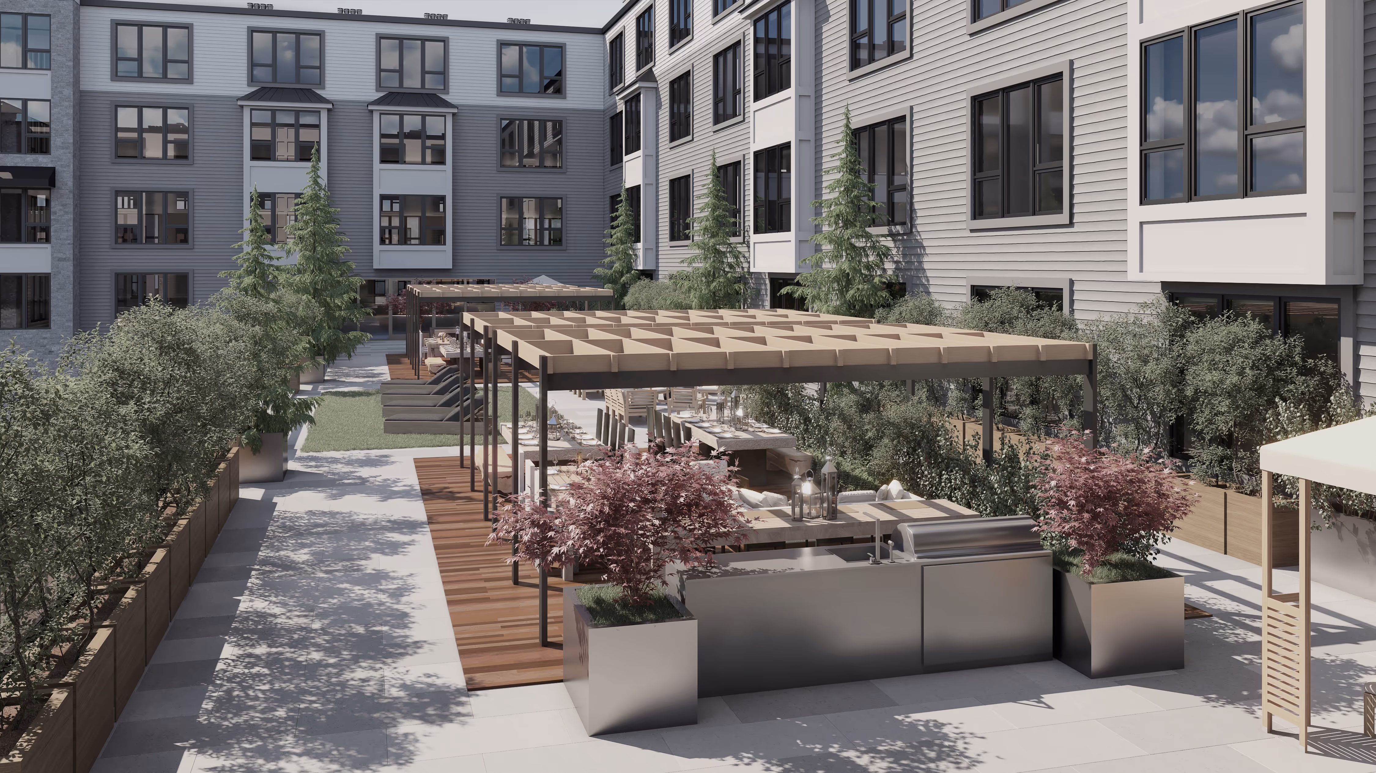
This five-story apartment community pairs durability with modern character. The façade layers light and dark siding with stone accents, giving the building depth and a clean, contemporary presence. Large black-framed windows bring in natural light while emphasizing the crisp material palette.
At its center, a landscaped courtyard offers wood decking, steel pergolas, and lush greenery—outdoor rooms for dining, lounging, and gathering. The result is a residence that feels both grounded and refined, combining urban living with a sense of openness and ease.